Mike Collinge {currently nomadic}

Outstanding individuals

Hailing from Wellington, Mike’s gone on walkabout. I know, I know, tenuous, it’s an aborigine thing, but bear with us. Perhaps it’s better we think of it as more of a design pilgrimage – a pilgrimage from the ol’ Long White Cloud to Europe; Hamburg to be exact (as we type), via a scattering of Scandanavian hotspots, Mike has asked not what the design world can do for him, but what he can do for it. Design world, give Mike Collinge a wave.

Don’t be under any illustions, he’s no rookie – he’s served over a decade working for the likes of DNA and Designworks and has a mighty crafty bag of tricks to show for it. So, if you bump into Mike on his European sojourn, give him a nod…

Tw. mikecollinge  / Facebook

mike collingemike collingemike collingemike collingemike collingemike collingemike collinge

Heroes – Ben Bos

Heroes

This week’s Masters Monday, Zebra’s Martin Maher talks Ben Bos

There is one book in my collection that I always go back to for reference. It’s not a huge, casebound tome filled with hundreds of pages of clever, poetic verse and tons of pretty pictures. It’s a smallish, humble, paperback book about a Dutch designer who’s work still looks as fresh, vibrant and downright stunning today as it did when it was first created back in the 1960’s, 70’s and 80’s. The book is called Design of a Lifetime and it’s the monograph of a truly great Dutch designer named Ben Bos.

RandstadBen Bos

Ben Bos is known for his work at renowned multidisciplinary Dutch design group Total Design. He wasn’t the most well known designer to come from Total (that would be one Mr Wim Crouwel) and he wasn’t even a true partner, but he worked longer at Total than any of the partners and his legacy is plain to see in the pioneering work that he and his team created for Randstad, Ahrend and De Gruyter.

If you can find a copy of this, sadly rare book, it is well worth a read. It certainly wasn’t all fun and games at Total Design and although Ben was there for a very eventful 28 years he certainly had his fair share of ups and downs. Whilst his colleague Wim Crouwel is always portrayed as quite a jovial, modest and self-effacing type of chap, Ben Bos in comparison is often depicted as a very stern and serious man. It’s a shame as his seriousness is most likely just a very passionate and professional approach to his work. And what work it was.

Ben Bos

Ben studied at the Amsterdam Graphic College and Rietveld Academy with Wim Crouwel from 1955 to 1962. He then worked for Ahrend, firstly as a copywriter and later as their art director. He was the very first employee at Total Design in 1963 and later became a creative director there. He left Total after 28 years. His specialised field was corporate identity and identity systems and his major clients were Ahrend, Randstad Employment Agency, Furness Logistics Group, Belgian General Bank and De Gruyter.

Eye magazine summed Ben’s achievements up very nicely in issue 59. They wrote: ‘He is a Renaissance man: designer, journalist, copywriter, photographer, studio manager, initiator and chairman of the Nederlands Archief Grafisch Ontwerpers.’ Ben was initiated into the AGI in 1978. He won several international prizes which include awards from Stuttgart, Ljubljana and Brno as well as a World Logotype Award in 1998. He is an honorary member of the Dutch Designers Association BNO and the Brno Biennale. Ben has also lectured and taught all over Europe, the US, Israel and Japan. He still works (at aged 82) and also paints as well as being the author of several books. He recently wrote Unit Edition’s excellent book based on Total Design’s work from 1963 to 1973.

Ben BosBen-Bos-Design-of-a-Lifetime-1

What I love about Ben’s work is it’s timelessness. To me, any one piece of his work could have been designed just last week even though it was most likely designed 40 years ago. I’m also a huge fan of logos that use simple, geometric and abstract shapes in unexpected ways. Some of Ben’s logos rate up there with the work of the masters Saul Bass and Paul Rand for their enduring, ageless qualities. If you can’t find a copy of Design of a Lifetime then I would highly recommend Unit Editions ‘TD 63-73’ as it contains many examples of Ben’s best work whilst at Total Design. The book is beautifully designed by the brilliant Spin too so what’s not to like. I would hurry though as it is already sold out on their website. This, just like ‘Design of a Lifetime’ looks destined to become a collector’s item.

deGruyter

Organ Studio {Perth}

Awesome agencies / LWC

Over on the western coast of Australia, sunny Perth plays host to our Southern hemisphere agency of choice this week – Organ Studio. We love the fact that they claim to provoke curiosity with their work, in turn we were curious about that interesting name of theirs. Turns out it’s a creative take on their ability to work in harmony with their clients and network of collaborators. We’re sure by now you are curious enough to set your peepers onto some of their design treats – fill your boots…

Tw. @organstudiowww.weareorgan.com


THIS IS Studio {London}

Awesome agencies

So you know that bit in Jerry Mcguire when Renee Zelwegger says to Tom Cruise ‘you had me at hello’ … well the moment I saw that someone at THIS IS Studio drink Malvern Water (bottled from my hometown) I was sold! It’s kinda the same.

As for the work… well where do you start? THIS IS Studio appear to be able to turn their hand to just about anything, from crafting a mark to knitting a pair of trainers. They have an immense balance, seemly able to call on a childlike playful side when working on numerous music videos but also can show the restraint and consideration needed for those delicate projects where design should we understated.

What I like the most though it that they are giving back, helping develop the next generation ensuring that ideas engage with audiences and that Malvern Water is drunk at all times.

Tw. @ThisIsStudio / www.thisisstudio.com


Heroes – F.H.K. Henrion

Heroes

This week, Martin Maher talks F.H.K. Henrion (1914-1990) – a true giant of British graphic design.

During a long and eventful career Henrion was not only president of the most prestigious of design organisations (AGI), he also designed some of the most powerful social posters of World War II as well as single-handedly pioneering the concept of corporate identity programs. With accolades like these, as well as many more, one would think Henrion would be a household name within our own industry, but sadly it seems this is not the case.

Born Frederick Henry Kay Henrion in Nuremberg, Germany on 18 April 1914, this highly talented, award-winning designer was granted his British nationality in 1946. He trained as a textile designer in Paris and he worked under Paul Colin in Paris and London from 1936 to 1939. It was whilst in Paris that he came across the works of Cassandre, the Surrealists and the Modernist movement.

FHK

During World War II he became a consultant for the exhibitions division of the Ministry of Information and US Office of War Information in London. It was here that he created some of the most powerful and influential social posters of the time. Henrion’s work often used elements of photomontage as well as collage. He pioneered the use of Surrealist compositions within the language of visual communications and advertising in Britain.

In 1951 Henrion started his own design consultancy named Henrion Design Associates. HDA worked within the areas of corporate identity, exhibitions, packaging and book and magazine design. Of his corporate identity projects one of his most well known works was the identity for KLM (the Dutch airline) which is still in use 60 years after it’s creation. Other notable identity programs included Blue Circle cement (also still in use), Tate & Lyle, British Midland and the National Theatre.

Tate-&-LyleKLM

Henrion later became a consultant to Henrion, Ludlow & Schmidt who were corporate identity specialists. Henrion also played a very significant role in the area of design education. He lectured at the Royal College of Art in London from 1955 to 1965 and headed the Faculty of Visual Communication at the London College of Printing from 1976 to 1979. Henrion became the third president of Icograda in 1968  as well as president of AGI. He was also Master of Faculty of ‘Royal Designers for Industry’ as well as leader of the faculty of Visual Communication at the London College of Printing.

It’s been said that the ability of a good designer can be measured by the longevity of any one piece of work. Whilst some identities are updated simply because a new chairman has come onboard, a truly great logo can last, untouched throughout the entire history of a company. It’s for this reason alone that I rate Henrion up there with other giants of design such as Saul Bass, Paul Rand, Milton Glaser, Herb Lubalin and the late, great Alan Fletcher.

FHKFHKFHK

Cornwell {Melbourne}

Awesome agencies / LWC

Cornwell (not to be confused with Cornwall – home of the British Cornish Pasty) have a very simple recipe for creativity, one which we like the sound of. In their own words: ‘We foster a culture of creativity. This creates possibilities. This attracts talented people. Their talents flourish. The clients get exceptional work’. If these are the results then we reckon their philosophy is a pretty solid one – simples!

Tw. @Cornwell  / www.cornwell.com.au


Lunchtime McLovin’

News

Pixel Picnics has landed to liven up your end of week lunchtimes and squeeze your creative juices. So what is it? A handsome question to which the answer is thus; a social gaming platform built especially for creatives. Y’see? Just out of beta, you can expect daily challenges and mini games plus a lively weekly LIVE game (with a real life presenter) specifically targeted toward creative folk like me and thee.

Played through your Twitter account, it’ll consume 25 minutes of fun every Friday lunchtime – 1.00pm UK time (sorry overseas folks) – with the chance to interact with other likeminded folk, prizes are dished out for the fastest fingers – awesome prizes in fact, donated by top notch sponsors including FontDeck, and Treehouse. Does your boat duly float? The games are free to play, social and thereby signify the start of the weekend!

Founded and pioneered by Craig Lockwood, you can read a bit more about the games’ genesis on his blog. So turn on and and tune in playa, there’s a handy taster below (Star Wars themed from May 4th) – head on over to the site for more details and follow PP on Twitter here… have fun chums.


Heroes – Michael Wolff

Heroes

Continuing our mini-series of design heroes, former Creative Director of The Brand Union and founder of Perth & Singapore-based studio Zebra, Martin Maher talks to us about the legendary Michael Wolff

Most designers have heard of the company Wolff Olins. Ok so that’s obvious statement of the year out of the way. We know them from their innovative and intelligent identity systems, even non-designers would acknowledge the controversy surrounding their identity for the Olympic Games. I actually really like this highly dynamic identity and I think people were pretty quick to dismiss it, but that aside, it’s fair to say a lot of people know about the great work that Wolff Olins have pioneered. A company that has been described as ‘the world’s most influential brand business’ must be doing something right.

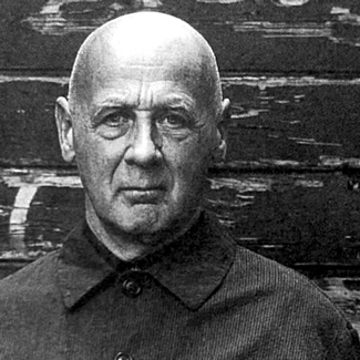
A lot of people know of Wally Olins too. Some see him as the founding father of modern brand identity, particularly in the area of brand architecture. I’ve always found his books to be excellent handbooks on everything brand related. So it’s safe to say that Wolff Olins and it’s co-founder Wally Olins are well known within the design community. But what about the other co-founder of the company. What do we know about Michael Wolff, the creative part of the partnership. It’s been written that he’s eccentric, a bit off-the-wall, unconventional and overall a bit of a maverick. In fact, all the things that make great creatives, well, great.

Michael was born in 1933 to Russian parents who had re-located to England from St Petersburg. He was said to be a quiet, sensitive child and he loved animals, which would later become somewhat of an inspiration in his work. He didn’t like school much and when he finally left he spent a year in France where he became interested in architecture and on his return to London he enrolled in the Architectural Association School. He soon left and ended up dabbling in fashion design and interiors. After a brief spell in national service he found a job at Olympia working on exhibition stands. He then went on to work with the design department for Crawfords Advertising. Later he worked for the BBC as a set designer. But it was whilst working for James Main that he first met Wally Olins. They got on exceptionally well and Wolff Olins was born in 1965.

Whilst here Michael was responsible for some of the most innovative and original identities of the 70’s and 80’s. His fascination with animals came to life in logos for Hadfields’ paints (a red fox), Bovis (a kingfisher) and later the use of a goldfish with his post Wolff Olins company Addison. Using a full colour illustration of a bird as the symbol for a building company was brave but it paid off and Bovis still use the kingfisher to this day. It was this playfulness as well as a lightness of touch that gave Michael’s work such originality. His work at Wolff Olins was hugely influential and highly brilliant and with Wally Olin’s strategic vision and business mind the company was unstoppable. Among their clients were Audi, Apple (the Beatles company), British Telecom, P&O, Renault, 3i, Pilkington and Volkswagen.

Wolff-3iBovis

But Michael slowly became disillusioned and dissatisfied with the work. He attended a course with the controversial Erhard Seminar movement which was all about self discovery and Michael came out with a new outlook on life. This new Michael Wolff didn’t sit so well with the rest of the management and during a now infamous boardroom coup Michael was asked to leave. At the time several reasons were bandied about in the design press but no one really knew what happened. What it did mean though was the beginning of the end for this particular era of the company.

Having an idea is a block to having more. If you have an idea, just throw it away. You think you’ll never have another one but you will … sometimes you just have to leave things alone.” – Michael Wolff

Michael went on to work as the Chairman for Addison but this didn’t last long as he didn’t like the traveling and missed the more hands-on approach to working that he loved. He left and after a short stint as a non-executive of Newell and Sorrell (which later became Interbrand) he formed the Fourth Room in 1988 where he was ‘director of imagination’. This radical company was a loose partnership of like-minded individuals who chose the best suited, outside consultancies to do the actual work. This lasted a few years but eventually ended and since then Michael has worked as Michael Wolff & Company. His more recent clients include 3i, Citibank, Mothercare and the Ministry of Sound.

Michael has always had a highly curious approach to his work. Imagination and originality have always been key to his process and to call him a visionary wouldn’t be that far off the mark. I’ve always loved his work and in my opinion he really should be cherished as a true pioneer of British design. Designers like Michael, Alan Fletcher, Derek Birdsall and companies like Hipgnosis spearheaded a very British approach to graphic design during the 70’s and 80’s. This later paved the way for original thinkers like Peter Saville, Barney Bubbles, Neville Brody and Jonathan Barnbrook all of whom could be seen as unconventional and somewhat quirky in their own right. It’s these individuals that have really helped make our industry such an exciting and fascinating one to work in. And thankfully this DNA lives on in wonderful British companies like Johnson Banks, North, Spin, Build, NB Studio, Browns, Venture Three and Moving Brands.

BTP&O

Check out www.michaelwolff.eu.com