Kris Sowersby founded Klim in 2005 with a humble desire to make some typefaces for the kiwis; eight years on Klim has an international following and Kris has three certificates of excellence from the Type Directors Club of New York.
Kris currently lives and works out of his hometown of Wellington, New Zealand. Designers Journal were excited to catch up with him when he was last in town…

©www.typoberlin.de
Kris, you trained at Wanganui Design School, what happened next?
After design school I wanted to go to a typeface design school overseas but that was expensive. There were no jobs so I started a design business with a friend, no money, no clients, no experience. It was called The Letterheads Limited. We made a poster and we sent it out to people we wanted to work with. We got about a 1% strike rate.
I’m assuming Letterheads is no longer in operation? How did Klim come about?
The Letterheads Ltd. is still the legal trading name that I operate under. Klim was created as a brand to sell my typefaces. I always wanted to design type and needed a proper sounding name to do it with!

You sell your typefaces exclusively through Village. Can you talk a little about this choice.
Chester got in touch as he was looking for designers. He took a chance when I was just starting out and he saw that I had potential. He helped me through the development process of my first typeface. It was an investment for him. He now runs a program called ‘Incubator’ where he finds young designers that don’t have the resources to finish a typeface and he invests in these designers. I liked this approach, it felt more like a partnership than some of the other options out there.
Young creative Kiwis are prone to jumping ship overseas, never been tempted?
I am lucky to not have an office so essentially I can work anywhere as long as there is an internet connection. These days you don’t have to be overseas to do international work and New Zealand is my home.
Who are your influences in New Zealand?
I would say I was influenced more by designers rather than other typographers. I like to see what other people are doing, what typefaces they are using and what they are trying to achieve because that is ultimately what you are aiming for. You don’t make a typeface to exist on it’s own, you make it for people to use it and to communicate with.
What are your thoughts on the NZ design industry?
I think I stand somewhat beside it rather than within it. It’s really great at present. Everyone just tries their hardest to make good work. It’s competitive but friendly between firms with a lot of respect between each other.
Do you hope to grow the culture of typeface design in New Zealand?
I would like to teach in some capacity at some point but when the time is right. When I can teach without my personal biases getting in the way.
The Chatham Islands commissioned you to design a custom typeface for them, this must have been rewarding being something so close to home.
Very much so. It’s a very graphic decorative typeface. This came from the forms and figures that they carved into trees. I had a photocopy of the book that documented this work and I created a direct reference back to this with the letterforms, which was great because they felt like they had ownership over it. The Chatham Islands have a total exclusive on this, it would be a tragedy to sell it to anyone else.
How does New Zealand’s history, or lack of, affect your work?
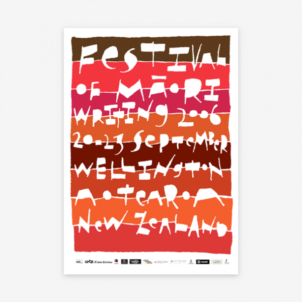
There is no real archive of specimens, the UK and America have their traditions and histories. You can have an English typeface or an American typeface but there is no New Zealand typeface. It’s a double-edged sword really because, while I lack reference points, I feel free to pick and choose.


Do you feel this gives you a neutrality as you are not biased towards a particular historical base?
I will never be entirely neutral because I have to filter through my own taste. Doing multiple genres is for me a learning curve. If you look at National and Founders, there are a lot of similarities but they are two takes on a genre, it’s two ways of learning. I guess because I wasn’t taught I feel the need to learn genres by doing.
You describe your way of working as the magpie approach, can you explain this?
Magpies are:
1. Opportunistic scavengers and will eat anything once they have discovered it’s edible.
2. A collector of shiny things or attracted to shiny things.
3. Able to mimic over 35 species of native & introduced birds, as well as dogs and horses.
To translate this into my approach: I take inspiration from all typographic sources, I collect type specimens and I am happy to work in almost any typographic genre & style.
With the typeface Hardy’s the brief was the fuse the old with the new. How did you approach this?
I think what they meant was that they had this entire history and heritage to draw on and they wanted to bring that into a contemporary sense which is generally, in my opinion, how things progress. If you look at all the things in the 40’s and 50’s and what they thought the year 2000 would be, I mean where is my jet pack and our little hovercars. You can’t ever just axe everything and have something that stands alone. I took the serifs and explored a way to make it acceptable to myself, it didn’t look old but it fitted within the Latin typeface genre, it didn’t feel old and musty.
What is your opinion on the digitisation of typefaces of the past?
There was a point where the old typefaces had to be turned into digital versions and to be honest it wasn’t done that well. I remember seeing Gill Sans on metal for the first time and thinking ‘wow’! These typefaces were designed for the print process specifically.

Would you ever get involved in resurrecting them?
I have said I wouldn’t be I might change my mind. I have often thought if I got asked to redo the digital version of Gill Sans would I do it and I don’t know? One persons version would be very different from anothers, it’s a lot of pressure. Are remakes ever better than the originals? You would have to have the right motivations, essentially doing it for the typeface.
You work alone at present. Ever considered expanding?
It’s a hard question. I have been thinking about it but I guess the question is what would be the reason and why? The big reason for me would be to give something back but it’s a big commitment, financially and personally. Ideally you always want to employ someone who is better than you, to help push your practice.
And what does the rest of 2013 hold for you?
The biggest thing will be turning klim.co.nz into a full retail shop for my typefaces. This has been a complicated, long-running saga that is finally going to see the light of day!
www.klim.co.nz / Tw: @klimtypefoundry
