Best Awards {New Zealand}

News

It’s that time of year again down in the Southern Hemisphere, the best of the best are on parade courtesy in New Zealand’s national design awards, Best. With the usual suspects notching up a handful of nominations each it’s also great to see some new smaller agencies coming through, along with, for the first time, a number of recognised names from over the ditch. With the awards beginning to develop a following overseas it would be great to build on this awareness in the Australian industry and leverage Best onto the global stage. That’s the future anyway, let’s now take a look at the present and partake in a little crystal ball gazing. Who’s going to pick up the gongs within the Graphic section come 11th October? I would hazard a guess the following beauties might have a good shot…

Graphic Arts
Gingeralla — Special Group
 
This little gem has been popping up in cafes and bars recently. A great commercial example of graphic arts in action.

Gingerella

Best Effect (Effectiveness award)
H2Go — Unified
 
While the illustrators are the heros here you have to give a running high five to the simple idea of ‘making water look cool’. I’d hazard a guess that H2GO have shifted a fair few bottles since this artistic invasion took hold.

2. March Lauch

Corporate Communications
OzHarvest — Frost Design

A lovely pieces of corporate communication, a strong brand look and feel, simplicity and a great tone.
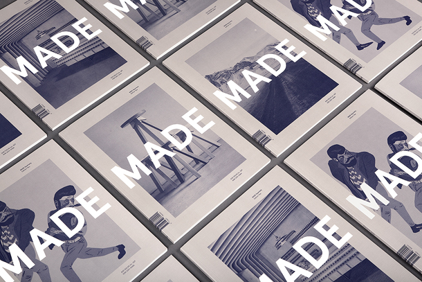
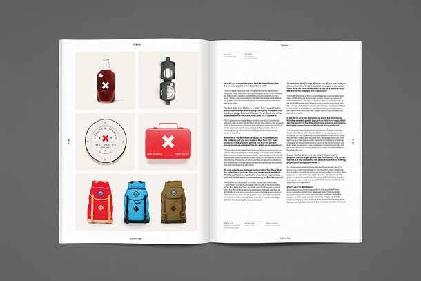
 

Frost_OzHarvest_03

Editorial and Books
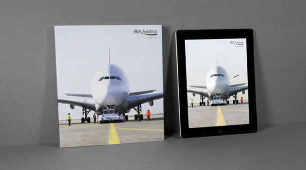
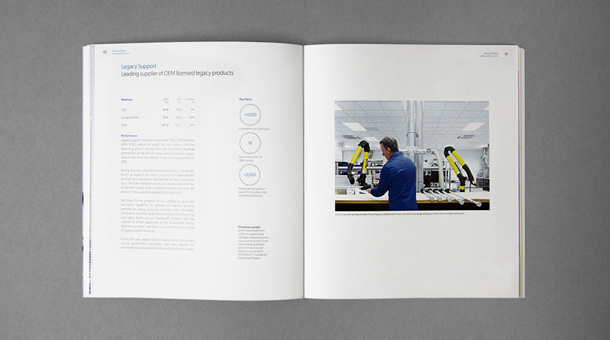
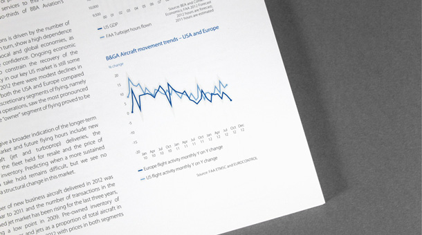
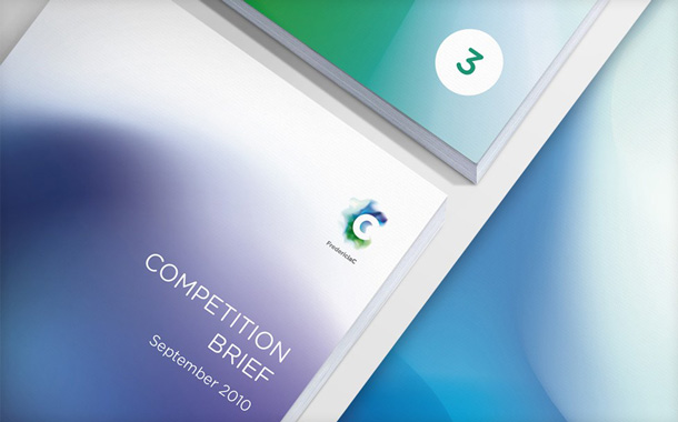
Issue 3 — Studio Magazine 

A cheeky little plug for a winner of a project I have contributed to. Studio Magazine offers a rare insight into the world we work within with a nifty combo of fresh design and insightful content (if I do say so myself!)

IMG_5773

Environmental
B&F — Supply
I love this piece of environmental work because it really embraces the medium. Rather than just making something that looks good, Supply have taken this idea to the next level and created a truly interactive experience.

BF_Environmental_8

Identity Development (Large Scale)
Sovereign — Designworks
To be honest this category is the least impressive for me. Creativity and ideas seem to be down unfortunately. Designworks’ work for Sovereign caught my attention from a photography perspective, nice to see a client invest in adding warmth to their brand through imagery.

DW_Sovereign_ID6

Identity Development (Small Scale)
Antarctica New Zealand — BRR
This one has done the rounds of the blog-o-sphere. Its now high time my friends over at BRR picked up a worthy gong for a great conceptual piece of branding.

1_BRR_NZARI_1

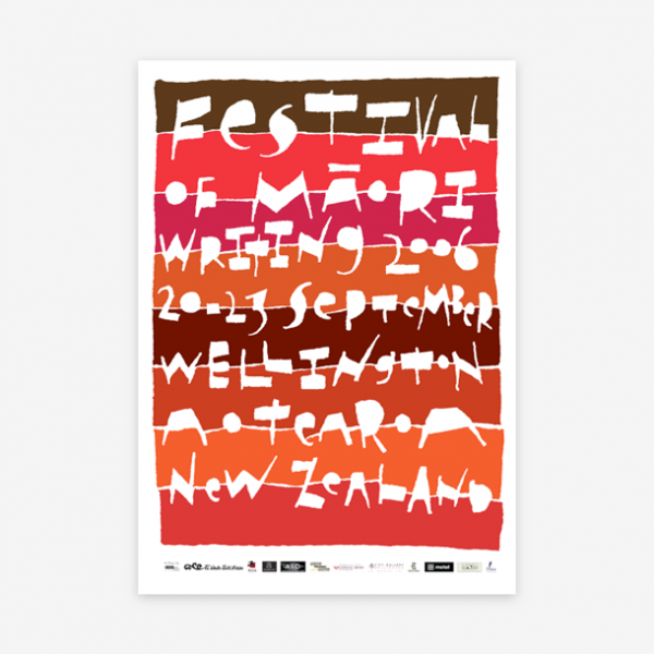
Nga Aho (Maori Award)
Ora — BRR
This award is an interesting one, celebrating true collaboration between designers, clients and cultures through a representation of New Zealand’s indigenous heritage. With only three finalist BRR have a good shot at this one too.
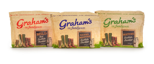
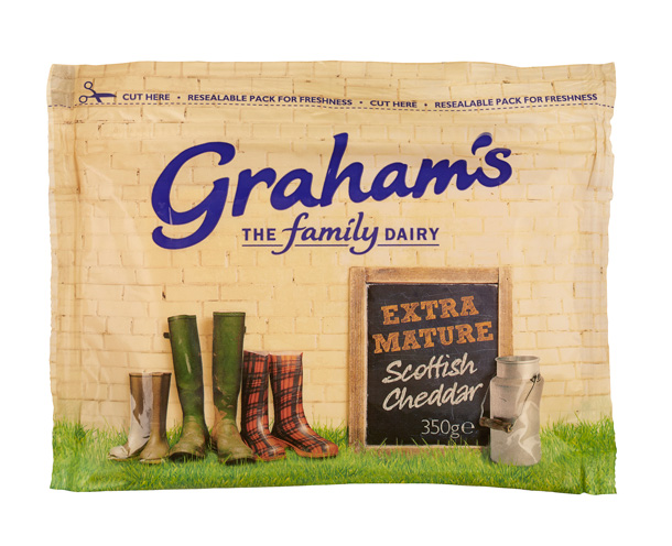
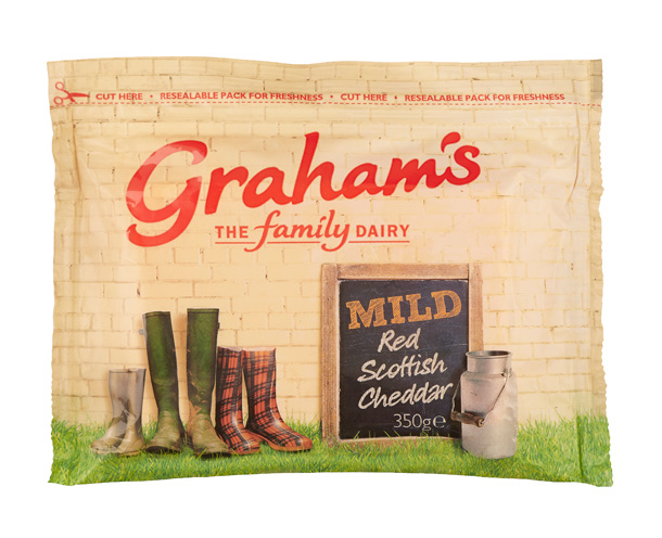
9_BRR_Ora_NgaAho

Packaging
Popchips — Marx Design
This one is a favourite of mine. Great to see designers rolling their sleeves up and getting stuck into a truly hand crafted approach — with great results!

Pings_Popchips_1_1

Selp Promotion
Like Stamp — Saatchi and Saatchi
A bit of a cliche I have to say but you’ve got to hand it to them, this really does encapsulate the simplicity we all strive for in self promotion and is a winner when it comes to nailing the ‘stay on the clients desk’ mission.

Design_LikeStamp4

Student
Chuan Tea — Anny Yuan
Great to see some nicely executed packaging making it’s way into the student category this year. A discipline often overlooked in the study-sphere, this gem shines through the sea of publication design. Great work.

IMG_0064

Visual Communication
Ecoya — Special Group
This one is a winner for me. Fantastic idea for a truly arresting piece of visual communication beautifully executed. What more could you want?!

Best_Awards_Ecoya3


That’s a wrap folks. Check back post October 11th to find out who went home with the gold.

Tw: @bestawards


Creative Network YCN launches new Members’ Magazine

News
YCN

Creative member network YCN has launched a brand new Members’ Magazine. The inaugural issue of You Can Now Magazine is designed & art directed by Matt Willey and edited by YCN Founder Nick Defty and fittingly takes the theme ‘begin’ as its editorial starting point, following on with a visually loaded series of ideas, essays and inspirations.

“We want to make the most of the printed format to feed the curiosity of our members, in a way that compliments our digital publishing and events. We hope to spark creativity and action in all kinds of directions” comments Nick.

The publication’s opening section presents a ‘celebration of getting started’ and includes an extended feature on the busi- ness of launching a new magazine with input from a spread of magazine maestros including Jeremy Leslie (MagCulture), Dan Crowe (Port), Robert Bound (Monocle) and Charlotte Rey (ACNE Paper), among others. All are illustrated by rising French star Tiffany Beucher.

Other contributors include menswear design legend Dries Van Noten, Google Creative Lab’s Iain Tait and Food Futurologist Dr Morgaine Gaye. And in an extended feature, beautifully photographed by Carol Sachs, Paul Flynn breaks bread with restaurant entrepreneur Mark Hix.

It’s free to join YCN, and those who do can buy a copy exclusively from the YCN website for just six english bucks, or, if you’re local pick up your copy in the YCN Shop & Library at 72 Rivington Street in London.

The next issue, themed Get Lost, is due hit the streets in November.

YCN_COVERNEW2_850 YouCanNow_0001_850 YouCanNow_0002_850 YouCanNow_0003_850 YouCanNow_0006_850 YouCanNow_0007_850 YouCanNow_0009_850 YouCanNow_0010_850 YouCanNow_0011_850 YouCanNow_0014_850 YouCanNow_0016_850

Profiles — Kris Sowersby

Profiles

Kris Sowersby founded Klim in 2005 with a humble desire to make some typefaces for the kiwis; eight years on Klim has an international following and Kris has three certificates of excellence from the Type Directors Club of New York.

Kris currently lives and works out of his hometown of Wellington, New Zealand. Designers Journal were excited to catch up with him when he was last in town…

Kris

©www.typoberlin.de

Kris, you trained at Wanganui Design School, what happened next?
After design school I wanted to go to a typeface design school overseas but that was expensive. There were no jobs so I started a design business with a friend, no money, no clients, no experience. It was called The Letterheads Limited. We made a poster and we sent it out to people we wanted to work with. We got about a 1% strike rate.

I’m assuming Letterheads is no longer in operation? How did Klim come about?
The Letterheads Ltd. is still the legal trading name that I operate under. Klim was created as a brand to sell my typefaces. I always wanted to design type and needed a proper sounding name to do it with!


Screen shot 2013-08-04 at 5.25.38 PM

You sell your typefaces exclusively through Village. Can you talk a little about this choice.
Chester got in touch as he was looking for designers. He took a chance when I was just starting out and he saw that I had potential. He helped me through the development process of my first typeface. It was an investment for him. He now runs a program called ‘Incubator’ where he finds young designers that don’t have the resources to finish a typeface and he invests in these designers. I liked this approach, it felt more like a partnership than some of the other options out there.

Young creative Kiwis are prone to jumping ship overseas, never been tempted?
I am lucky to not have an office so essentially I can work anywhere as long as there is an internet connection. These days you don’t have to be overseas to do international work and New Zealand is my home.

Who are your influences in New Zealand?
I would say I was influenced more by designers rather than other typographers. I like to see what other people are doing, what typefaces they are using and what they are trying to achieve because that is ultimately what you are aiming for. You don’t make a typeface to exist on it’s own, you make it for people to use it and to communicate with.

What are your thoughts on the NZ design industry?
I think I stand somewhat beside it rather than within it. It’s really great at present. Everyone just tries their hardest to make good work. It’s competitive but friendly between firms with a lot of respect between each other.

Screen shot 2013-08-04 at 5.23.52 PM

Screen shot 2013-08-04 at 5.30.42 PM

Do you hope to grow the culture of typeface design in New Zealand?
I would like to teach in some capacity at some point but when the time is right. When I can teach without my personal biases getting in the way.

The Chatham Islands commissioned you to design a custom typeface for them, this must have been rewarding being something so close to home.
Very much so. It’s a very graphic decorative typeface. This came from the forms and figures that they carved into trees. I had a photocopy of the book that documented this work and I created a direct reference back to this with the letterforms, which was great because they felt like they had ownership over it. The Chatham Islands have a total exclusive on this, it would be a tragedy to sell it to anyone else.

How does New Zealand’s history, or lack of, affect your work?
There is no real archive of specimens, the UK and America have their traditions and histories. You can have an English typeface or an American typeface but there is no New Zealand typeface. It’s a double-edged sword really because, while I lack reference points, I feel free to pick and choose.

rsa

bnzfestival_of_maori_writing


Do you feel this gives you a neutrality as you are not biased towards a particular historical base?
I will never be entirely neutral because I have to filter through my own taste. Doing multiple genres is for me a learning curve. If you look at National and Founders, there are a lot of similarities but they are two takes on a genre, it’s two ways of learning. I guess because I wasn’t taught I feel the need to learn genres by doing.

You describe your way of working as the magpie approach, can you explain this?
Magpies are:

1. Opportunistic scavengers and will eat anything once they have discovered it’s edible.

2. A collector of shiny things or attracted to shiny things.

3. Able to mimic over 35 species of native & introduced birds, as well as dogs and horses.

To translate this into my approach: I take inspiration from all typographic sources, I collect type specimens and I am happy to work in almost any typographic genre & style.

With the typeface Hardy’s the brief was the fuse the old with the new. How did you approach this?
I think what they meant was that they had this entire history and heritage to draw on and they wanted to bring that into a contemporary sense which is generally, in my opinion, how things progress. If you look at all the things in the 40’s and 50’s and what they thought the year 2000 would be, I mean where is my jet pack and our little hovercars. You can’t ever just axe everything and have something that stands alone. I took the serifs and explored a way to make it acceptable to myself, it didn’t look old but it fitted within the Latin typeface genre, it didn’t feel old and musty.

What is your opinion on the digitisation of typefaces of the past?
There was a point where the old typefaces had to be turned into digital versions and to be honest it wasn’t done that well. I remember seeing Gill Sans on metal for the first time and thinking ‘wow’! These typefaces were designed for the print process specifically.

charles_woodhouseconde_nastlove

Would you ever get involved in resurrecting them?
I have said I wouldn’t be I might change my mind. I have often thought if I got asked to redo the digital version of Gill Sans would I do it and I don’t know? One persons version would be very different from anothers, it’s a lot of pressure. Are remakes ever better than the originals? You would have to have the right motivations, essentially doing it for the typeface.

You work alone at present. Ever considered expanding?
It’s a hard question. I have been thinking about it but I guess the question is what would be the reason and why? The big reason for me would be to give something back but it’s a big commitment, financially and personally. Ideally you always want to employ someone who is better than you, to help push your practice.

And what does the rest of 2013 hold for you?
The biggest thing will be turning klim.co.nz into a full retail shop for my typefaces. This has been a complicated, long-running saga that is finally going to see the light of day!

www.klim.co.nz  /  Tw: @klimtypefoundry


MADE Quarterly returns with its secound edition

News

MADE Quarterly returns for it’s second edition and boasts a pretty impressive list of contributions from all walks of modern makers. Lovingly crafted by Hunt&Co’s Thomas William this issue features the likes of March Studio (AUS), Mast Brothers (USA), Huet Brothers (NLD), Stevie Gee (GBR), Earth Tu Face (USA), Best Made Co (USA) along with a host of other talented souls.

With such a global line-up across multi-disciplines of design getting them all into one edition must have been one hell of a challenge and does explain the longer than expected time between each editions. However, as Thomas explains the added time allowed them to tweak with the publication and hone some of the subtleties that have really add the quality and subject matter that the publication reflects.

“We had a very ambitious line-up, but feel it was well worth the wait. Content aside, we’ve also made some small design improvements internally typesetting and general layout. I feel we’ve stayed true to the first edition, but have also made some subtle improvements.”

Edition Two also features its contributes work on four individual covers which have been overprinted using a dark purple over warm grey to create a distinct look with extra depth. And best off all some good news for those outside of Australia as MADE Quarterly Edition Two is now available worldwide (with free shipping) from their online store.

w. www.madequarterly.com


01_MADE_Cover_Grid 07_MADE_Spread_BMC 08_MADE_Spread_BMCB 10_MADE_Spread_HW 11_MADE_Spread_BHMADE-covers 15_MADE_Spread_SG 16_MADE_Spread_UW


When threebrand met Graham

News

Creative branding and design agency and packaging favourites of DJ, Edinburgh-based threebrand, have designed shelf candy for a new cheese product launched by Scotland’s largest independent dairy company Graham’s The Family Dairy’s new Scottish cheddar cheese range ‘Graham’s’, which officially launched at the Royal Highland Show last month.

The brief was to create impactful packaging for the new cheese range of mild, mature and extra mature cheddar that communicates the brand’s core values of family and farming.

Campbell Laird, managing director at threebrand, said: “We have designed the packaging to be distinctive and provide extra shelf stand-out while reflecting the colourings of a traditional creamery.”

Carol Graham, marketing director at Graham’s ‘‘The cheese category is a very competitive market place so we needed to ensure Graham’s entry was impactful with high quality products and eye catching packaging. threebrand has created something very different to existing products, which has been well received by our retail buyers as well as consumers.”

The strength of the cheeses in the range find their differentiation through colour (for my money it would have been nice if the welly boots changed too, but hey ho), and overall the farmhouse look is executed finely, setting Graham’s up handsomely to go out and sit alongside and compete with Cathedral City et al.

Tw. @wearethreebrand


350gGroup.HR ExtraMature350g.HR GrahamsCheeseGroupComp MatureCheddar350g MildRedCheddar350g.HR

SAS go BBA

News

London’s SAS have completed work on the annual report for Signature Aviation, which, they say is more than just a compliance publication. At the centrepiece, were a series of images from Benedict Redgrove that show the style of the business and reflect its sense of quality.

“It is a tool that is used to build the company brand as it grows in strength each year in the aviation services market. Our role is to ensure that the company has an image that demonstrates the quality of the parent and subsidiary businesses, whilst meeting best practice in compliance.”

SAS have added what they believe to be the first e-book annual report in the UK as a response to the increasing use of tablet devices by investors and senior executives.

You might remember SAS from a post earlier in the year, when we featured their rebrand for global law firm Herbert Smith Freehills. Once again, this is smart, tidy corporate work pivoted around superb photography from the boys on the front line.

Tw: @sas_creative and @sas_insights.

BBA Aviation AR 2013 – eBook from SAS on Vimeo.

SAS_CS_2013_ANNUAL_BBA_WEB_01 SAS_CS_2013_ANNUAL_BBA_WEB_02 SAS_CS_2013_ANNUAL_BBA_WEB_05 SAS_CS_2013_ANNUAL_BBA_WEB_07 SAS_CS_2013_ANNUAL_BBA_WEB_08 SAS_CS_2013_ANNUAL_BBA_WEB_09 SAS_CS_2013_ANNUAL_BBA_WEB_10 SAS_CS_2013_ANNUAL_BBA_WEB_12 SAS_CS_2013_ANNUAL_BBA_WEB_13

Make {Copenhagen}

Awesome agencies

Long time lovers may remember a post from back in May 2012, when we featured NZ’s finest on tour designer Mike Collinge, taking it to the masses ~ touring his expertise around Europe. Well, it looks like he’s found a place to hang his hat, in the shape of Copenhagen design studio Make, who themselves produce top drawer treats, as evidenced by their spanking new site…

“The world is our playground and we are passionate about creating compelling visual strategies and communicating brand stories that captivate your audiences.”

Aces.

Visit: www.make.dk

 ImageGen-1.ashx ImageGen-2.ashx ImageGen-3.ashx ImageGen-4.ashx ImageGen-5.ashx ImageGen-6.ashx ImageGen-7.ashx ImageGen-8.ashx ImageGen.ashx

Pop goes SomeOne

News

Ok ok, it’s pretty well known that here at DJ we’ve been seduced by the somewhat wicked touch of the dastardly designers at SomeOne. It’s for many reasons; we love their thinking and their work, on the whole, and their approach is a little bit different, which we appreciate. So they slapped a smile all over our chops with this new branding for WorldPay, “the UK’s top payments provider” and a “bit of a global giant”.

A new service, WorldPay Zinc, is a revolutionary one, putting credit card payments in the hands of small businesses… “just launching this week a new keypad device to enable small businesses (like say a visiting hairdresser, or gardener, or plumber) to take card payments. Anywhere there is a phone signal.”

SomeOne created the name and the visual brand identity which centres around representing the high speed digital payments – represented by high speed photography capturing the moment when two elements meet (shot by Simon Warren – using airborne paint pigment).

Read all about it here.

Zinc_Device_940x415 Zinc_Downloads_940x415 Zinc_Email_940x415 Zinc_Pack_940x415 Zinc_Tshirt_940x415 Zinc_UI_940x415 Zinc_Zn_940x415