L is for all kinds of Lovely

News

London studio Build has recently launched its take on an Animal A-Z, and it’s all kinds of delightful. The colourful and charming set of prints feature a host of mammals, birds, reptiles (and a solitary crustacean), each having their way with their corresponding letter of the alphabet. Fancy the Flamingo for yourself, or if you have interest in the Iguana for a friend, the prints may even make an excellent yuletide gift.

Michael C. Place from Build said: “We’ve wanted to do a A—Z for quite a while now, each animal has been drawn in a simple, playful and bold style. Allowing the individual character traits to shine through. The set is fun and graphic, each piece complementing the others. All the prints are designed to be displayed individually, in groups or as a complete set”.

The set of 26 designs are available in seven different print sizes, and all are printed in-house at the Walthamstow-based studio. Head over to the Build shop to take a goosey gander at the whole collection > http://bybuildshop.com/


BLD_A-Z_04 BLD_A-Z_02 BLD_A-Z_01 A-Z-ALL_MINT

No Sugar hard at work

News

When Swansea based graphic designer Martin Grugel, of No Sugar Studio fame, wanted to expand his portfolio, he naturally returned to his love of portraiture and painting. Now, after six hard months, Martin has launched the product of his talents in the form of an online print shop called Hard Artwork.

Among the portraits available from Hard Artwork are sporting heroes such as Bradley Wiggins, pop icons including Mick Jagger and Michael Jackson and even contemporary political figures like Barrack Obama. Martin says, “I have always loved creating portraits. There is something about an image of a face that draws you in instantly and is inherently retrospective. My inspirations growing up were Rembrandt and Carravaggio, both portrait painters who captured a strong sense of the subject and this is something that I feel is so important when it comes to my own paintings”.

Martin has developed a unique style within his work which he believes makes him stand out from the crowd – many of his paintings are unusually done in the medium of watercolour, using strong colour and varied brush strokes to create depth and tone.

As well as selling all the original artwork and prints in the online Hard Artwork shop, Martin also takes on commissions. He explains, “you can find something in every face that captures the essence of that person and that is what I strive to do with every portrait I take on. It is so rewarding to see the look on someone’s face when you hand them a painting of a person that they admire or feel passionate about. I always hope the face will ‘jump out’ at them and show a part of their personality that they can feel a connection to”.

Hard Artwork was launched in early November and the response he says has been tremendous. When asked about his favourite piece of work he has done so far, Martin says “Keith Richards from the Rolling Stones was wonderful to paint as his face tells a thousand tales but really, every face tells a story, I just strive to show that in every one of my paintings.”

Peruse the Hard Artwork site or follow on HA or Martin.

ha-biggie-closup-original ha-emboss-print ha-jacko-situ ha-jagger-situ ha-jones-closup-original ha-keith-frame ha-ronnie-closup-print ha-tube-packaging ha-wiggo-original

The Meringue Girls Cookbook

News

Well Made Studio have been getting their Merry Berrys on, courtesy of The Meringue Girls Cookbook, published by Random House.

The book design itself takes its lead from the centrepiece – an enormous Rainbow Meringue Layer Cake – taking cues from this colour palette to split the sections and applying it to full colour pages for maximum impact. To add more depth and avoid flat colours, illustrator Kenn Goodall was commissioned to paint large, sumptuous mixed-hue watercolour washes, better reflecting the streaks of dye in the piped meringues.

Says WMS’s Gemma Germains: “We designed typographic section and recipe titles throughout that were inspired by a collaborative mood board of inspirations, vintage and modern, and this is all set against spectacular images by renowned food photographer David Loftus.With one eye on adding value to the book and further establishing the girls’ personalities, we proposed that key recipes be filmed with bonus information, and then implemented this throughout the book using Augmented Reality. We also art directed a massive installation, building a giant colourful meringue mural in East London and photographing it for use as the endpapers and the official press shot.”

Check these the flip out… Meringue Girls mural making of video / Well Made Studio website

book-design-random-house-cover  book-design-random-house-food-photography book-design-random-house-inside-spread book-design-random-house-installationbook-design-random-house-meringue-girls-small book-design-random-house-type-design-small book-design-type-illustration-small

Subtracting to reveal more

News

For a company all about finessing those details and seeking out that little extra to inject into their craft, Moving Brand has done the complete opposite. By that I mean instead of adding extra elements or complicated pathways they have subtracted in order to create a delicious set of letter forms and in most case simple marks that combine for the Blank identity.

MovingBrands_BLANK_system_06_708MovingBrands_BLANK_story_01_7081

Blank Digital are a New York-based boutique retouching and digital capture company. The quality of their stunning photographic and motion work speaks for itself, ensuring steady work with the best photographers in the business.

It would seem that a business repositioning prompted Blank to engage Moving Brands to do what they do best and to communicate the breadth and benefits of their new offerings. One of the main aims of the refresh was to craft an identity worthy of Blank’s expertise and to provide creative direction to deploy this new brand across their digital and physical touchpoints as Blank new offerings include motion capabilities, and an ambition to cement direct relationships with the world’s most successful luxury, fashion and media businesses.


MovingBrands_BLANK_system_01_708MovingBrands_BLANK_system_04_708MovingBrands_BLANK_system_05_708

Referencing Blank’s own editing process the simplification of the typeface to its furthermost recognised form, particularly with the ‘A’ and ‘N’ adds a playful side to the monochromic identity. It’s this abstraction together with the feeling of witnessing the typeface in mid-creation that defines the key storytelling aspect of the brand.

Abstraction with marks is a particular favourite of mind and when produced effectively demonstrates conceptional awareness and sound design thinking. Moving Brands is able to demonstrate both of these qualities as it plays with the human brain to create something that is mnemonic, that in its animated state allows the brain to retain better than its original.

After all this is a quality found in all the icon brands, to be relatable to the audience and leave a memorable impression.

MovingBrands_BLANK_experience_02b_708MovingBrands_BLANK_story_02_7083 MovingBrands_BLANK_feature_01_708 MovingBrands_BLANK_experience_04_7082 MovingBrands_BLANK_experience_03_7083

Whitlock & Sons {Marx Design & Running with Scissors}

News

Marx Design have been up to their old tricks again, this time with friends Running with Scissors on board for the ride. In their own words I’ll let them tell you the story of a man named Fred…

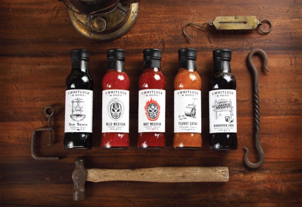
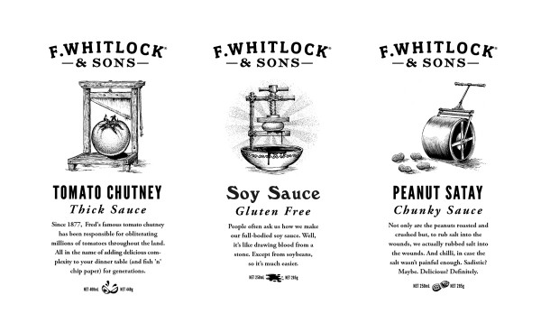
When Whitlock’s first started, over 100 years ago, Fred was the brand, and sometime in the last century he disappeared from the label. He was a real man, beard down to his chest (before it was fashionably ironic) his name deserves to be resurrected and so too, his values. By putting Fred back in the logo we add a real and emotive aspect to the brand, something that it was lacking.

The design inspiration came directly from Mr Fred Whitlock himself and his love of hunting. Since our audience are blokes, we wanted to tap into the dormant frontier huntsman that resides within (or the one he thinks he could be) but also appeal to his mischievous inner child.

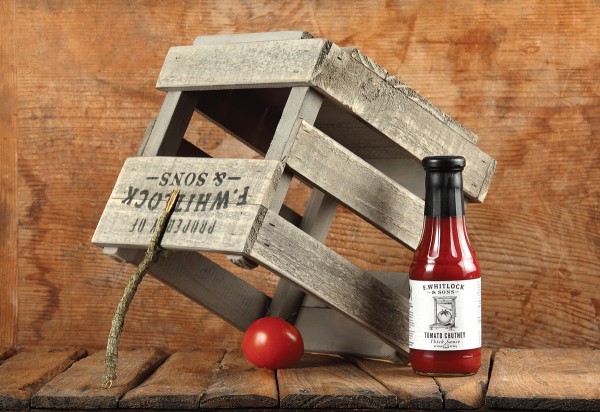
We wanted to draw on Fred’s era, the turn of the last century, but modernise it in a way that it appeals to the modern man’s more refined aesthetic sensibilities. We embraced the notion of building tricks and traps to ensnare ingredients and this became the driving idea behind the packaging. We drew on a classical story book illustration style and imbued each label with an element of subtle violence usually avoided in supermarket packaging.

Since the products are not located together in store it was important that we established a strong identity – one that is recognised across the store. In shelves awash with garish colours, our range exudes confident simplicity. Our men are pretty cynical of packaging (and marketing in general) they are looking for simple, more classic, honest packaging – jars, tins, glass. Something that can be reused or up-cycled. Guys like packaging that can have a second life and we envisage these jars taking up residence in the shed, full of nails.

And a final word from our client: “if something can make people stop at the supermarket shelf and smile then it is worth doing.”

2_1200 3_1200 4_1200 5_1200-1 5_1200 6_1200 7_1200 8_1200

www.marxdesign.co.nz     Tw: @ryanthemarx

www.runningwithscissors.co.nz

Best Awards Winners {New Zealand}

News

Awards season reached fever pitch down in the Southern Hemisphere last week with the winners of New Zealand’s national design awards, Best, being revealed. A night of revelry ensued where a handful of shiny gold awards were sprinkled over the graphics category along with one top purple pin prize, awarded to Special Group for their work on Karma Cola, the all round good egg in the beverage category. The judges said, “The entry brought together a compelling piece of story telling with obvious craft and a strong singular idea that challenges a drinks segment dominated by the big players. Memorable, fresh, witty and with an underlying good cause. What’s not to like about a project that delivers good Karma?”

Other stand out winners for me were a couple of great pieces of corporate communications from Designworks for the Metservice and WW1 Centenary.

Check out all the winners hereKarma Karma3 Karma4 Karma8 met2012-1 met2012-2_1 met2012-5_1 met2012-6_1 WW100 WW1002_1 WW1004_1 WW1006_1 WW1008_1.

Tw: @bestawards

A splash of something London

News

The task for Wellington-based London Studio was to develop a new brand for a range of New Zealand wines that could be sold internationally. The branding needed to be identifiable and unique enough to stand out in a cluttered international market but still be expandable for future additions to the product range.

The concept the guys created originated from the clients’ two great loves; namely painting and the French language. The Aquarelle Estate (french for watercolour) was born. A wine glass water colour graphic combines with white spaces and clean typography draws attention on the shelf and helps consumers to identify their preferred tipple.

More over at ~ www.londonstudio.co.nz

London-Studio-Aquarelle-Line-Up  bottle1 London-Studio-Aquarelle-Stationery London-Studio-Aquarelle-Watercolour-Lockupsbox

Zebra changes the stripes

News

Barringtons is a Perth-based firm of chartered accountants, operating for over 20 years and renowned for their entrepreneurial and progressive approach to dealing with their clients’ business. Unfortunately their original corporate identity didn’t fully match their thinking so, Designers Journal favourites, Zebra were engaged to provide an update.

Says CD Martin Maher; “We started by developing a new symbol, a hexagon that forms the shape of an open box. This symbol is made up of inter-connecting lines that reflect Barringtons interactive client relationships as well as their ability to solve complex problems and challenges. The box shape is open, as the firm it represents is open to new ideas and fresh ways of thinking. On the right side of this box is a subliminal letter B, helping to further personalise the new mark.”

Website

barringtons_1barringtons_2barringtons_3barringtons_4barringtons_5barringtons_6barringtons_9barringtons_7barringtons_8