The two sides of NZSO {The Church}

Awesome agencies

With the deadline for the New Zealand design awards, Best, fast approaching the top shops are beginning to gather up their finest pieces of work from the last 12 months and ears are beginning to prick up around the blog-o-sphere as we wonder what and who will hit the mark this year.

The Church have had a great year, not least with their work for NZSO, hope you’ve got your entry ready guys as this is a goodie.

Over to Creative Director Adam Cansino to take you through the thinking in his own words:

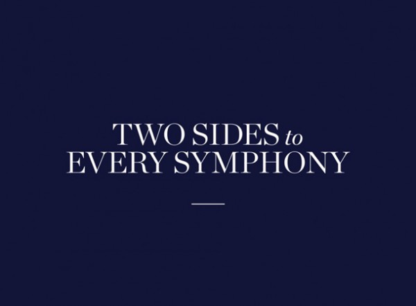
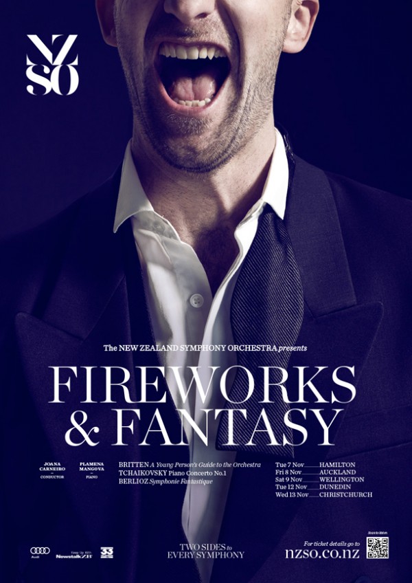
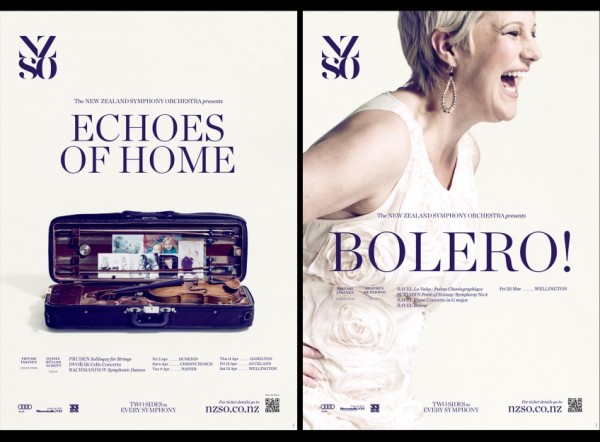
The goal of the 2013 campaign was to make the NZSO more accessible for everyday New Zealanders whilst still maintaing their premier status as a world-class orchestra. We achieved this by telling individual stories (view here) of both NZSO players and audience members around the theme ‘Two sides to every symphony’. It’s about highlighting the many dualities found throughout the orchestral experience – the practice and performance, before and after, seeing & hearing and newcomers and seasoned concert-goers to name a few.

The campaign is made up of two parts, first a subscriptions campaign which launched in October 2012 and the retail campaign which runs through-out 2013. For the first time these two campaigns have been based on the same creative, we feel it brings a level of consistency and accessibility that hasn’t been achieved before.

To make the subscriptions brochure even more personal we created four versions, specific to each main centre or area. – Auckland, Wellington, Heartland (central North Island) and Mainland (South Island).

We worked with two of our closest partners to deliver the campaign – firstly the exceptional photographer Steve Boniface to produce stunning portraits of orchestra members, audiences and instruments which formed the basis of the subscription brochure and onto the retail poster campaigns for the 2013. Secondly with Flying Saucer Films to develop nine short videos that built on and extended the stories featured in the brochure. Combining these beautiful videos with music from the 2013 musical programme, we were able to echo aspects of the shows ahead in hopes of drawing in a new and younger audience. The videos are accessed from a bespoke section of the NZSO website which we created.

www.thechurch.co.nz      Tw: @thechurchnz

NZSO_2013_v1-848x626NZSO_2013_v2-848x626NZSO_2013_v4-848x62603001_NZSO_2013_Retail_Fireworks&Fantasy_08_303001_NZSO_2013_Retail_Requiem_FA3NZSO_2013_v11-848x626NZSO_2013_13-848x626NZSO_2013_v7-848x626

Chips go Pop {Marx Design}

News

When Marx Design was asked to create a brand/mascot that would work across multiple products in the snack food category Ping was born,  the advocator of all things tasty and healthy. Ping’s first offering to tempt your ever conscious taste buds, courtesy of Marx Design is Popchips: Sea Salt, Salt & Pepper, Salt & Vinegar and Sweet Chilli and Sour Cream — take your pick!

When Marx Design were tasked with the creation of the Popchips packaging they were told to ‘avoid the clichés of traditional chip packaging in order to achieve cut-through’. Not ones to do things by half, they ticked this box then cranked the creative throttle up an extra notch and threw in 500 hours of man power to create, photograph and retouch real paper diorama creations for each variant.

In their own words: “The very name ‘Popchips’ led us to create a diorama execution in which the elements ‘popped’ off the page with light and shadows. This then became a running theme for the brand that extended to point-of-sale in the form of pop-up books and displays. One of the rules we set ourselves was to make sure the diorama scenes always carried an idea. For the Salt & Pepper variant we created a storm setting out of layered card. The scene resembles a storm of flavour putting a bit of zip in your chip”.

It’s not often something of this calibre lands in my inbox, not only a clear, simple idea well executed that’s doing something different but a real labour of love. Nice work Marx.

 www.marxdesign.co.nz     Tw: @ryanthemarx


Screen shot 2013-02-20 at 2.08.16 PMScreen shot 2013-02-20 at 2.07.02 PMScreen shot 2013-02-20 at 2.07.12 PMScreen shot 2013-02-20 at 2.07.21 PMScreen shot 2013-02-20 at 2.07.31 PMSour-Cream-&-Chives-Render-85g-NewSalt-&-Pepper-Render-85g-NewSalt-&-Vinegar-Render-85g-NewOriginal-Sea-Salt-Render-85g-NewPings Popchips Posters - Gill KAO FAPings Popchips Posters - Gill KAO FADSC_1556

London Studio {Wellington}

Awesome agencies

One of the best things about living in New Zealand has to be the abundance of delicious treats available, from farmers markets to Michelin stared restaurants, you are never far away from the next tasty morsel. Luckily for us designers this goes hand in hand with fine packaging design, a bounty of which we recently stumbled upon, courtesy of Wellington based London Studio… yes it got me for a moment too but they are New Zealand based I promise.

Feast your eyes on these mouth watering treats… good enough to eat I’d say!

www.londonstudio.co.nz


YCN Studio team up with Childline

News

ChildLine, the UK’s free, confidential helpline and online service dedicated to children and young people, have commissioned YCN Studio to write and produce an animation to sit within the ChildLine website, offering support to young victims of sexual abuse in search of help.

Many young people who try to find a way to talk about their problems describe the immense difficulty involved in “finding the words”. It was decided to focus on this insight by staging a conversation between a young person and a ChildLine counsellor, expressed typographically through animation.

The script explored the nature of these sensitive calls and examining the dynamic between the two roles, the common questions, concerns and reassurances. YCN opted not to show either character physically, relying on other devices to build empathy with the young character.

To execute the animation YCN commissioned Buck in Los Angeles through Friend in London to sensitively cell-animate the piece by hand, with delicate sound design produced by Ant Food. The animators did an incredible job of handling the dynamics of the piece and bringing it to life in a way that wouldn’t feel uncomfortable for the viewer.

Superb job. See more of YCN Studio’s work.

ChildLine: First Step from Buck on Vimeo.

image_1 image_2 image_3 image_4


Liverpool students shoot for the Ballon D’raw

News

“Illustration and Design students need to be able to maintain a balance between having something of their own to say and also being able to talk to an existing audience; the relationship between education and commercial practice” Mike O’Shaughnessy, Senior Lecturer, Liverpool School of Art & Design.

Ballon D’raw is a collaborative project between football magazine SPIEL and Liverpool School of Art & Design, which took the winners of the Ballon d’Or as a start point of an examination of the links between football and design. The project is part of a wider initiative by the university to interact with the creative sector & expose students to the demands of commercial practice.

Paul Gleeson, editor SPIEL Magazine said; “it’s great to work with final year students as their enthusiasm and ideas are brilliant. At the same time it gives them an opportunity to work on a live commercial project and to get all of the benefits that come with that; earning a bit of money and getting more exposure but more importantly getting used to the process of working for the wider audience and marketplace which is going to be key to their future career in a studio or as a freelance.”

In both design and football there is a requirement for creativity and hardwork in equal measure, “Footballers like Messi, Xavi and Gerrard are true artists, but like all creative people, their skill is born from knowledge and constant practice…” says Mike O’Shaughnessy “Design Practice and football are similar. But without the WAGS and designer clothes.”

The project is ongoing with a new brief being set for next year’s student cohort. The work with this year’s graduates is being released alongside a series of essays by SPIEL which will all be available here and will look to explore further the context behind each winner and their relationship with wider culture and art practises.

Read more about SPEIL and the posters here.
Twitter: @Spiel_Magazine


cryuffeusebiofranzlevplatini

Profiles – Chris Mitchell

Profiles

Genuinely, there are few people whose work over the years I have admired more than that of Chris Mitchell. I’ve enjoyed it for its precision, consistency, refinement and transcending timelessness and, in simplest terms, utter beauty. The list of top notch agencies who have Chris in their little black books is remarkable and his work has won countless awards for the people who commissioned him.

If you’ve never stumbled across the name before, the quickest glance at his website www.epicicons.com and you’ll soon recognise swathes of it ~ beautiful elements from beer packaging you’ve drunk, or crisps you’ve eat, or Marks you’ve been struck by. Prolific and of the most supreme quality, his style is synonymous with craft, process and exhaustive pursuit of perfect ~ “every line has to earn its place”, he says. Smart and stylish. We’re extremely grateful for Chris taking some time out to speak with us and talk about how quality matters and how design and illustration have always been bed partners…

Read More

SomeOne’s all seeing idea

News

Jeepers, creepers, it’s been a while since we’ve had a our fill of SomeOne brand-hugs so, always ones to duly oblige, SomeOne have come running, arms open though insisting on being big spoon. The product of several months work, the chaps and chapettes at SomeOne towers have created an adaptive new visual identity for a new visually-led advertising agency, BigEyes, based in Victoria, London.

The new agency is called BigEyes due to their visually-led approach to advertising. Martin Galton, Creative Director of BigEyes says ‘‘We want to make visually exciting work, but also honest representations of the brands we are helping communicate. We want to make work you can ‘look in the eye’ — work that is the right mix of truthful and interesting.’’

The identity is fuelled by a series of stunning and complex digital sculptures created by artists Field.io. The sculptures, when viewed from the front are designed to resemble the complex series of fine muscles that expand and contract to make up the iris of a biological eye. The data randomises, giving an infinite number of iris designs. These artworks are being used across a broad variety of applications — all with the idea of keeping things visually interesting.

‘‘The ever-changing branding enables the new agency to more easily explain their approach. It’s a brand that’s in permanent beta. Always learning, always helping.’’ says SomeOne co-founder, Simon Manchipp.

If Sauron had a fanciful eye for fashion, this is what you’d get… Get more of an eyefull and read all about it here

someone bigeyessomeone bigeyessomeone bigeyessomeone bigeyessomeone bigeyessomeone bigeyessomeone bigeyessomeone bigeyessomeone bigeyessomeone bigeyessomeone bigeyessomeone bigeyes

Zebra in Moda

News

Fashion merchandising company Palette 1.5 wanted to launch an online retail concept store that could compete with e-commerce giants the likes of Net-a-Porter and Asos. They wanted to create a brand with a distinctive space and attitude that would appeal to fashion-forward young women and men. With this in mind they approached the Singapore-based consultancy TFO to help with their marketing. TFO then asked Zebra to help develop the blueprint for the new brand.

“We wanted to avoid the more conventional approach the competitors seemed to use” explained Zebra co-founder Martin Maher. “Whatever we came up with needed to have an individual and distinctive feel. We presented a list of possible names and the client really liked the unusual and unique ‘Modajar’. We then created the visual identity and developed the brand’s persona and values. The uniqueness came with the idea of integrating the bird into the logo – this symbolises freedom and represents the idea of creative expression – which really embodies what Modajar stands for.”

Tw. @madebyzebra

modajarmodajarmodajar
modajarmodajarmodajarmodajar
modajarmodajar