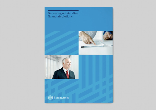
Barringtons is a Perth-based firm of chartered accountants, operating for over 20 years and renowned for their entrepreneurial and progressive approach to dealing with their clients’ business. Unfortunately their original corporate identity didn’t fully match their thinking so, Designers Journal favourites, Zebra were engaged to provide an update.
Says CD Martin Maher; “We started by developing a new symbol, a hexagon that forms the shape of an open box. This symbol is made up of inter-connecting lines that reflect Barringtons interactive client relationships as well as their ability to solve complex problems and challenges. The box shape is open, as the firm it represents is open to new ideas and fresh ways of thinking. On the right side of this box is a subliminal letter B, helping to further personalise the new mark.”