The London Community Foundation (LCF) were last years lucky winner of The Allotment’s ‘Unwrap a Designer’ competition. The competition is for charities in need of design expertise and the winner receives strategic and design guidance donated by The Allotment.
Interbrand Sydney have just release a little gem of a project completed a few years back.
Attila Yilmaz was just a guy following his passion for food. After traveling around Mexico, Attila discovered authentic ways to cook Mexican food and decided to mix his passion together with a hints of inspiration from his father and his Turkish roots to create Al Carbon. Meaning ‘over charcoal’, Al Carbon was part of the City of Sydney’s licensed food trucks trial.
Known for their award winning illustration and editorial work, I Love Dust were recently commissioned by Mother Jones to add ‘some neon-sign magic’ to an article in their May/June 2014 edition.
A new name, a new brand and a lovely looking new edition of Process Journal.
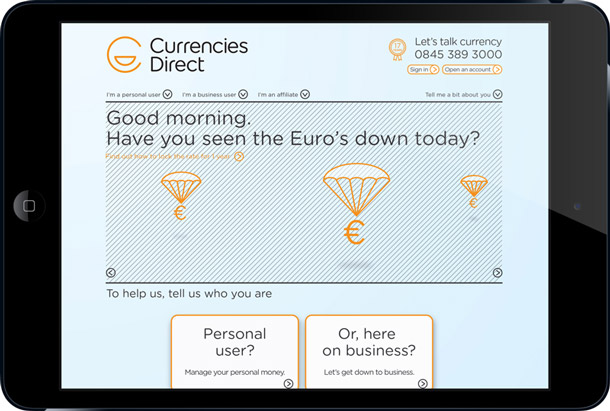
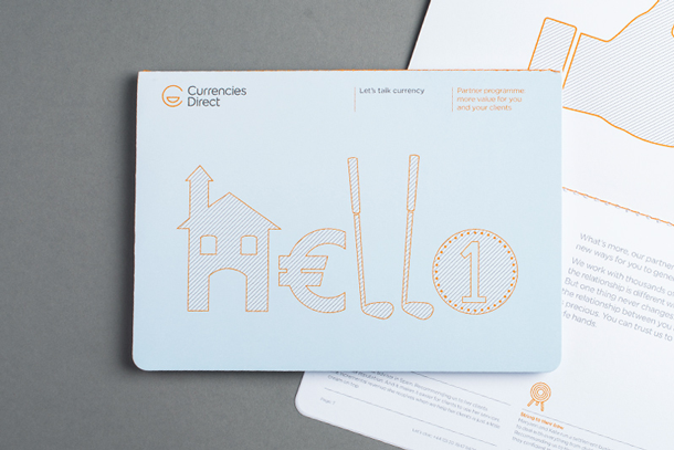
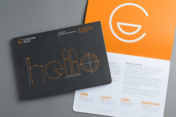
London studio The Allotment have launched a transformational brand for Currencies Direct, a £1.1bn business dealing for the past 17 years in the world of foreign exchange and international payments for both individuals moving overseas and for businesses buying and selling abroad.
The Allotment articulated a new vision, mission and a set of values which succinctly captured the unique personality of the business. Direct, human, simple, and driven became the mandate for the new brand.
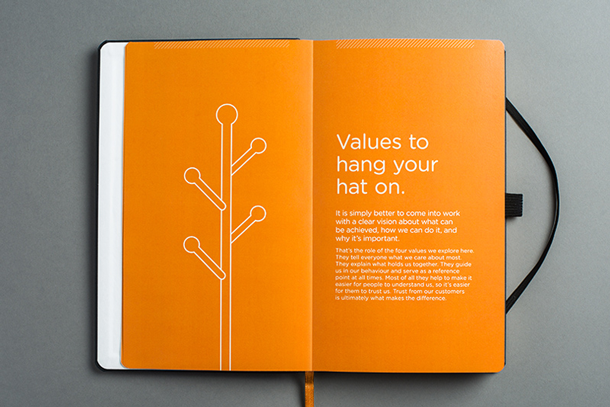
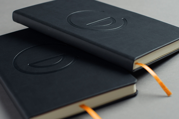
This led to the solution of the ‘Chatty’ icon for the identity and a tone of voice which is human and straightforward. No fluff, no jargon — just great service and value, delivered in a personal way. To support engagement internally they developed a ‘brand in the hand’ note book. This used storytelling to demonstrate what each of the values meant.
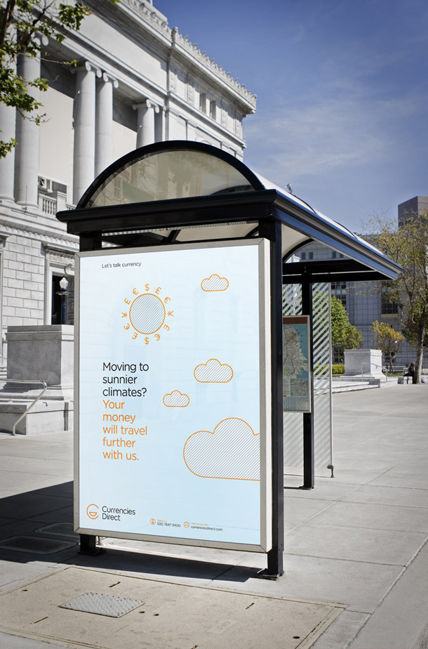
The ‘Chatty’ brand was developed across all touchpoints including market sector brochures and sales literature, the website design, signage for affiliates, office interiors, advertising and for animations that very simply explained the value of the brand to their customers.
Read more about the project here.

Currencies Direct – PFX from The Allotment on Vimeo.
Distinctive Repetition is an independent Dublin based graphic design studio. The studio was set up by Rossi McAuley less than two years ago and since then has worked with a diverse range of clients including small start-ups, artistic projects and not-for-profits with projects including print, identity and interior spaces.
Says McAuley; “The studio’s output is driven by three core principles; education, experimentation and creativity. We are influenced by the desire to understand the fundamentals of every brief and then assess them against our own capabilities. We take the time to investigate the range of production methods and possible outcomes inherent in any brief. To this end the studio practices design outside its core fields of training, applying our philosophy that the role of the designer is to solve problems and the role of the graphic artist is to make communication and design visually engaging.”

Anyone who knows New Zealand, knows Mad Butcher is a kiwi institution; the local butcher that expanded to become everyone’s local butcher. With this in mind it came as a surprise to see that the icon of the meat world had taken a leap of faith and decided it was time to update it’s branding – a much needed exercise.
The brand update was a collaboration between designers Peter Radich & Mike O’Sullivan, with the website being developed by The Space In Between. Peter says: “Although the new look & feel for the Mad Butcher was more of a brand evolution, we felt the strongest positioning for the brand lay in the past and the heritage surrounding butchery in New Zealand. The inspiration came from early butchers stores and uniforms with the use of the striped aprons and white surfaces a key component. We also looked at the iconic Kiwi status that both the Mad Butcher and Peter Leitch had with the brand.
The overall project brief was to bring the whole retail & brand back to a more traditional Kiwi butcher and give a real sense of history and tradition to the stores. Because the stores are owner operated franchises the new look & feel needed to be adaptable and easy to roll out across various signage sizes, building styles and store environments”.