A new estate agency that wants to make an impact, enter The District.
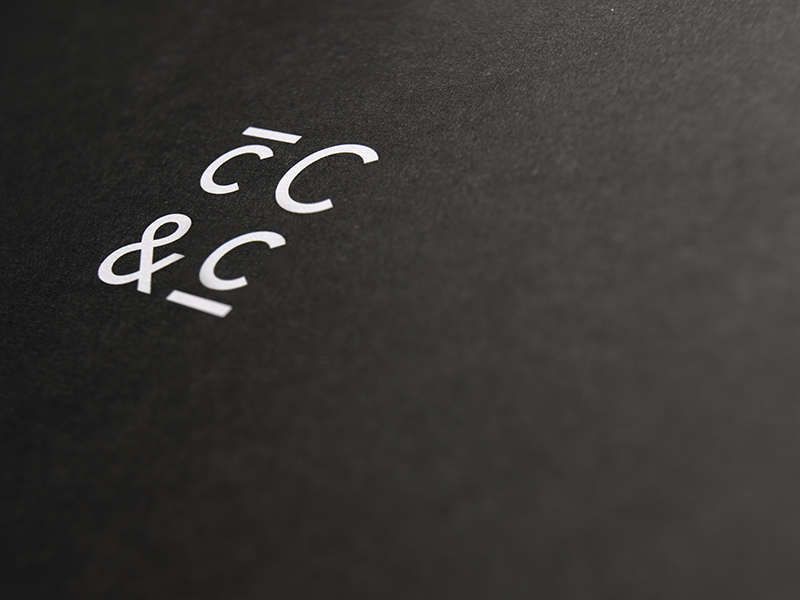
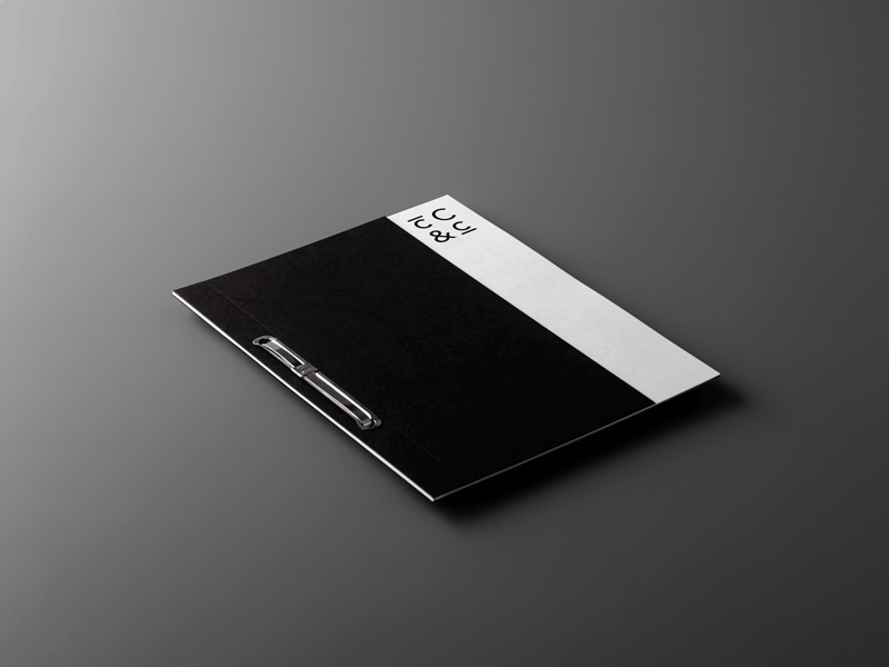
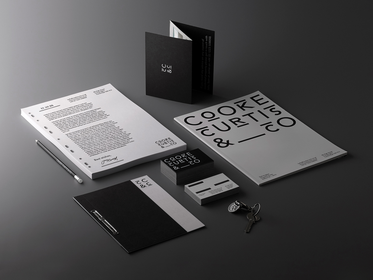
Out with the cliched imagery and in with a strong focus on typography together with a monochrome colour scheme. A subtly nod to brickwork has influenced the adaptive identity system which for the brand landscape. Key messages are at the forefront of the brand’s communications, implicitly conversational and using negative space to echo the plain speaking approach of the client which cuts through an industry fraught with hyperbole.
The District, are a UK (Cambridge) based creative agency that works in brand, digital, print and film. Cooke Curtis & Co is a new estate agency that wants to make an impact with a brand that is very fresh and stands out in the sector, while still holding onto the heritage of its founders who bring over 30 years of experience. Looks like the perfect mix.
www.thedistrict.co.uk