Interbrand AUS have been excelling themselves of late and their latest work for Melbourne Theatre Company is no exception.
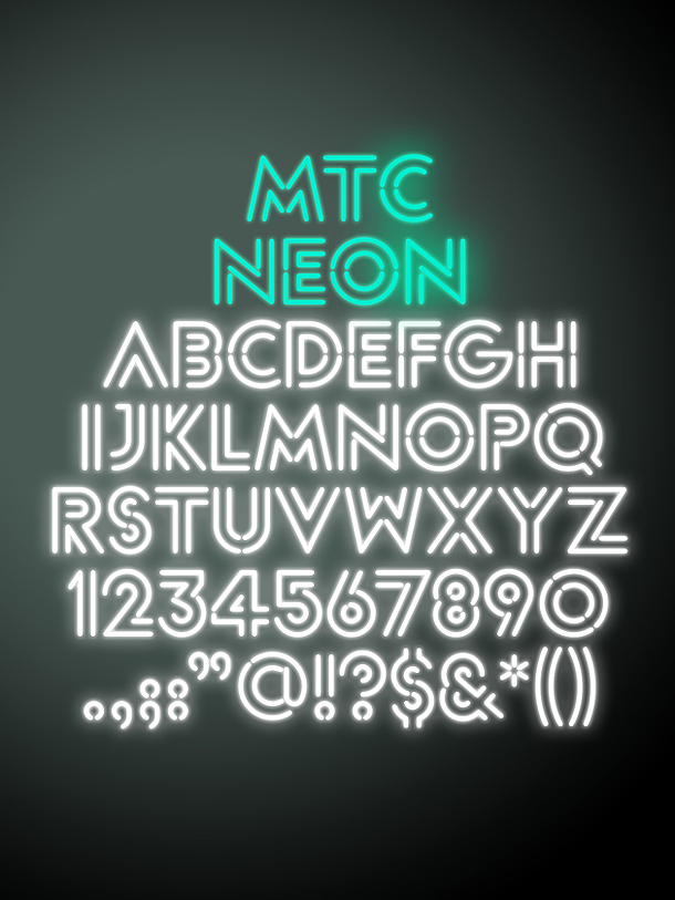
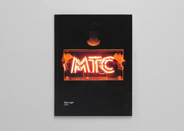
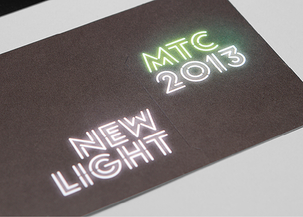
Using a spectrum of colours as a basis for the new vibrant identity, MTC (Melbourne Theatre Company) has been launched back onto the map with a new look to match their fresh season of productions for 2013. The brand’s genesis to position MTC as glowing brightly and shining its light on the audience and whoever is in its path is a nice theme, which has been beautifully executed with the help of a bespoke typeface MTC Neon.
The brief was to make the MTC more inclusive with great potential identified for new visitors beyond the loyal subscribers group and this new approach has gone a long way to breaking down those barriers.


The production posters for ‘The Crucible’, ‘The Cherry Orchard’ & ‘Neon’ are concept only and not final artwork.
