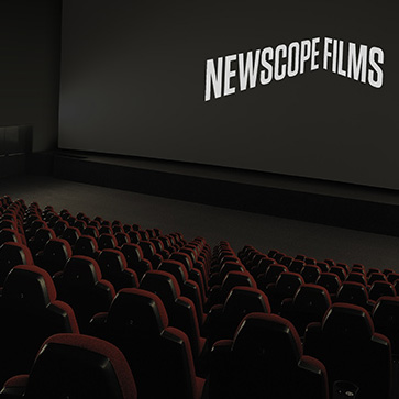
There’s fewer things in this life we take more satisfaction from than a good ol’ simple and smart identity solution. That’s right. Breath it in. Yeh. Tasty. Unlikely to be privy to that, but happy to oblige us regardless are London swashbucklers of swish Karoshi. They’ve filled our little lungs with this little trinket of an identity for independent producer of things for your tele box Newscope Films – a company who are “Innovative and advocates for highly conceptual and original genre films.”
Karoshi were commissioned to create a progressive identity solution which captured this brand spirit while remaining accessible to their broad, international audience. Developing a visual play on the notion of a unique perspective, the dynamic identity solution “evokes the movement of the animation with typographic inspiration being drawn from large-scale, three dimensional type heritage within film and cinema”… “The identity employs only black and white and each logotype is constrained to the maximum proportions of 2.4:1 – the current cinema widescreen standard.”
Initial stationery application encompassed 8 variations of the logo which will be expanded upon throughout rollout. The intention is for each subsequent production to carry a unique animated ident.
What tickles my fancy are subtle nods to filmgoing type of yesteryear that come through via some fairly solid background research, as well as the chaps seemingly taking good time to understand the medium. Whether you like the mark or not, it would be pretty hard to deny (pretty hard to the client to deny) the reasoning at presentation stage (take note younglings).
Read more about this puppy here. Wave n’ a wink here.
![]()
![]()


![]()
![]()

