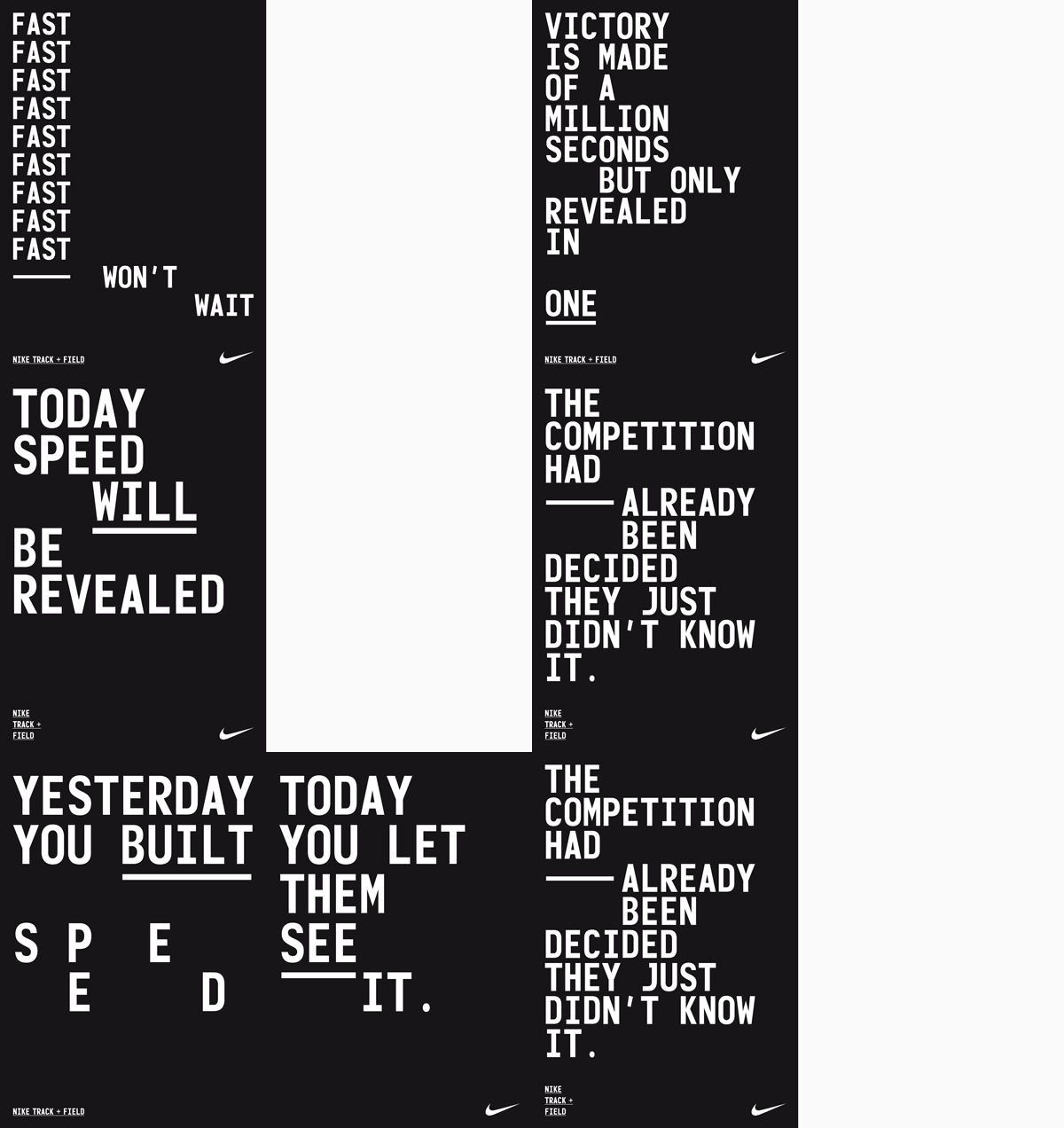
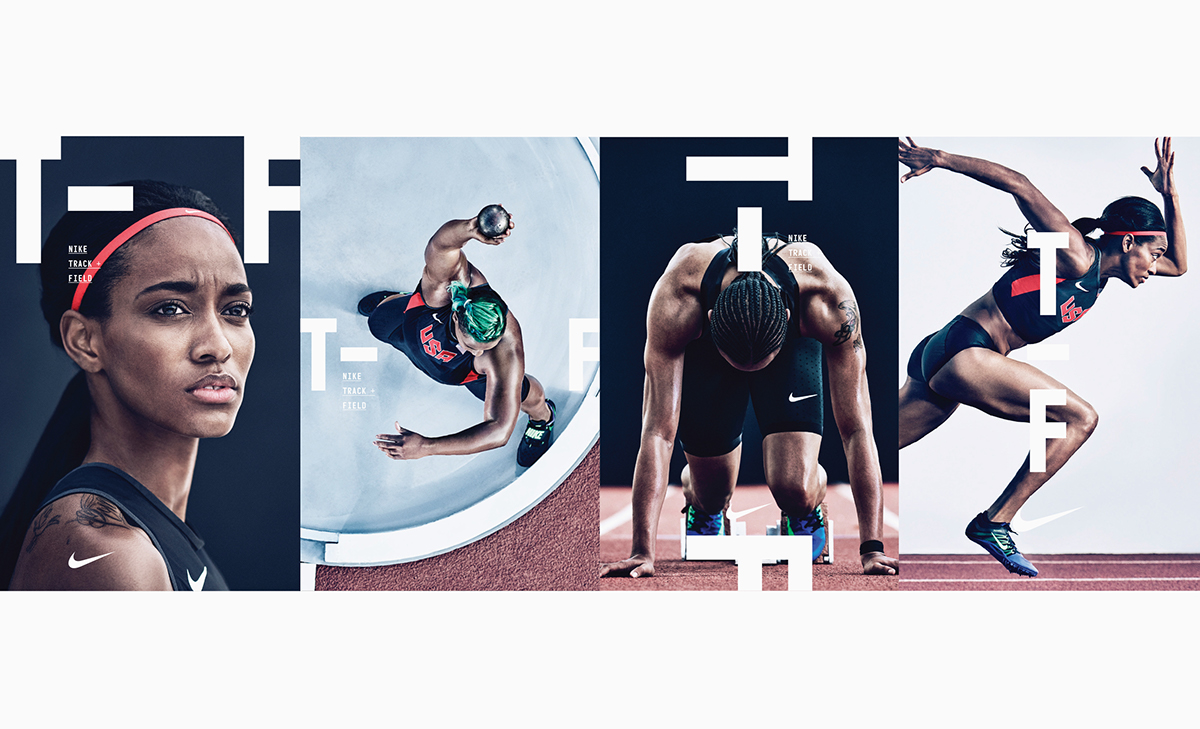
It seems so simple and obvious, but these are the hardest things to get right let alone successfully combine to form the bases of a branding system. Yet this is exactly what the team at Build have done with their latest work for Nike.
Build were commissioned to work with the Nike brand team on the new look and feel for Track and Field, 2016. Seemingly inspired by the lane markings of the running track, Build have established a strong combinations of line work to create a graphically system able to express a variety of striking patterns.
Coupled this with the playful use of language and layout, and you have something that strikes the perfect balance between simple yet powerful in its rawest form.
This comprehensive graphic system includes — Typography, typographic messaging, graphic marks, and patterns, including bespoke numerals. Culminating in a fresh and bold visual centre for use in all Track and Field branded applications, from press advertising, billboards, wild posting, OOH, apparel and event branding.


