With the increasing popularity of Craft Ale the industry has embraced good design and given the industry some much needed freedom.
Personality is still a key ingredient when it comes to both producing a distinctive ale and a successful design, so it’s not surprising that with this latest offering from the talented team at The District it has bags full.
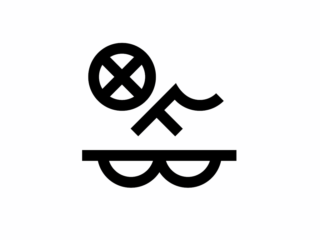
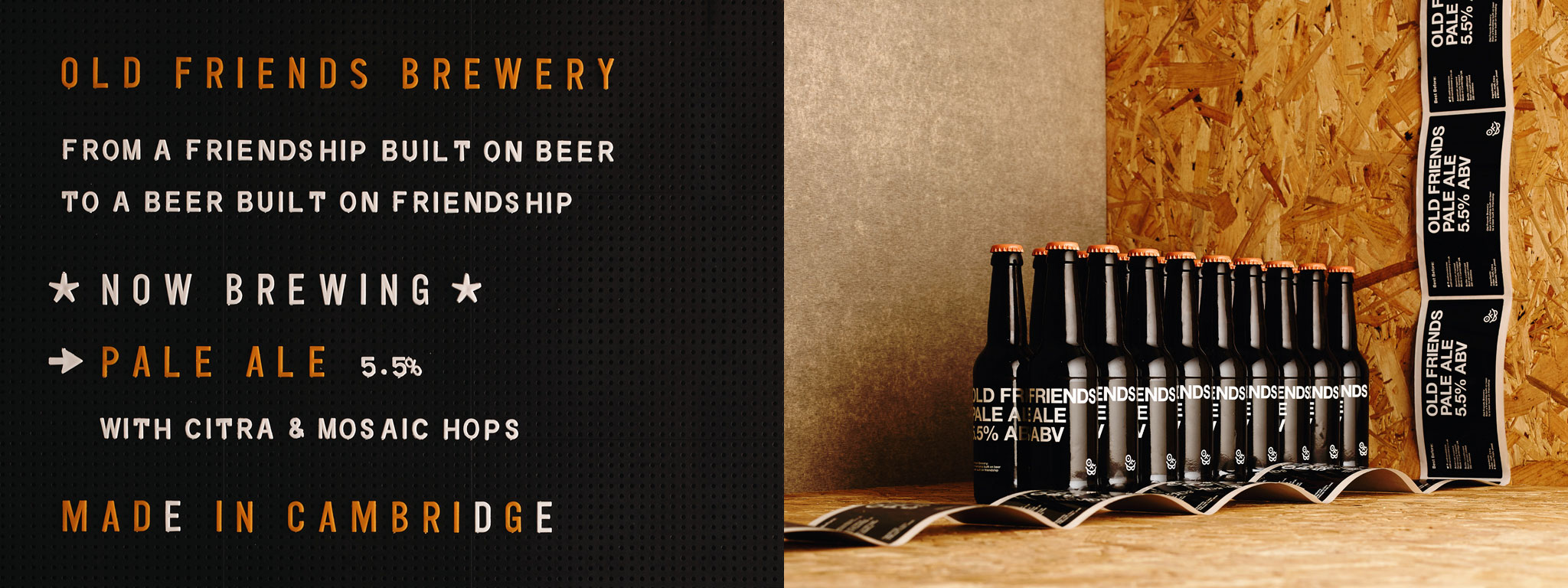
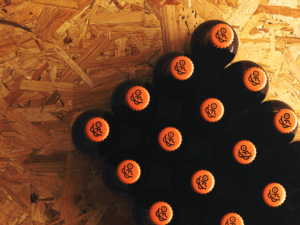
Old Friends Brewery was founded by two old friends who saw a gap in the UK’s burgeoning American–style craft beer scene for a Cambridge-based brewery. They reached out to their old friends at The District to come up with an identity, this smiley chap is the result.
“It’s in–your–face, maybe even a little truculent, but it’s not apologetic about the enthusiasm and passion that the brewers bring to their product” comments The District’s Creative Partner, Matt Bagnall.
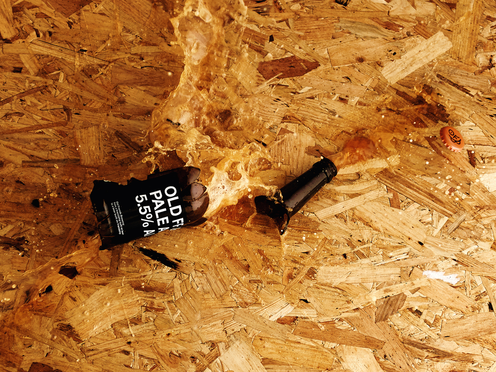
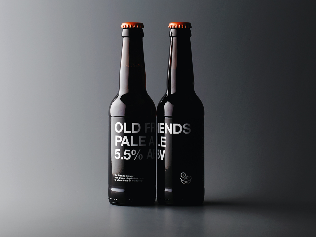
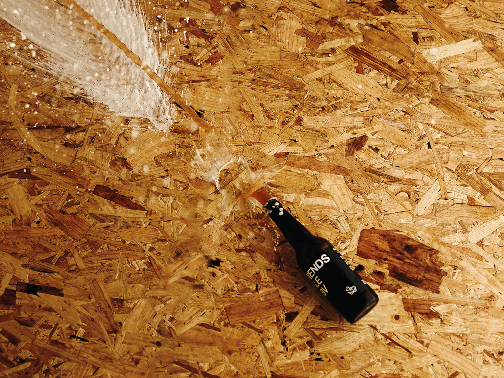
The bottle label introduces a bold, stripped back, black and white colour scheme and typography which contrasts with the playfulness of the marque. Colour is applied subtly through the bottle caps, which vary in colour for different beers and injects just enough contrast as to not overpower with character.