How do you solve the age old question, whilst eating ice cream we gain weight faster than we can put on the next episode on Netflix? Simple. You find an innovated factory and declare a war on sugar without compromising on the taste.
Swedish agency Snask are an agency who likes to do things with a twist and this latest offering is just that. Striving to challenge the industry by doing things differently, Snask worship unconventional ideas, charming smiles and real emotions.
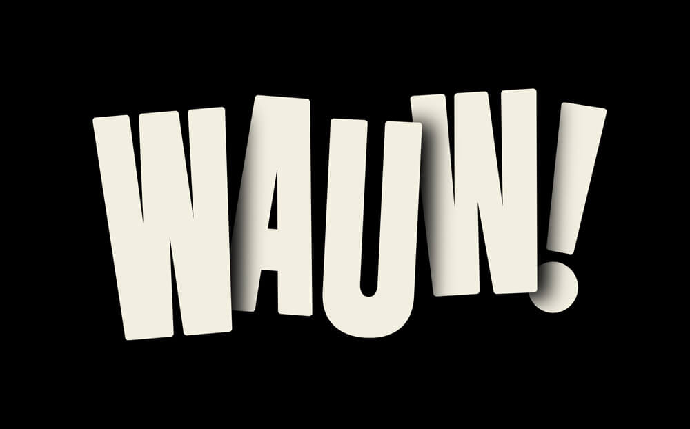
Named after the feeling you get when you eat the ice cream, Wauw’s brand is all about allowing you to indulge in an “all you can eat” world. Balancing this approach, the logotype manages to combine a playfulness and bold presence without feeling too dominant.
In order to differentiate the packaging from competitors and to avoid the luxury bracket, Snask used “tasty” and “kind” typography against a solid black backdrop. The result is a bold design that draws you in and, with the beautifully shot geometric balls of ice cream, leaves you wanting nothing more than to crack open the lid and have a taste.


