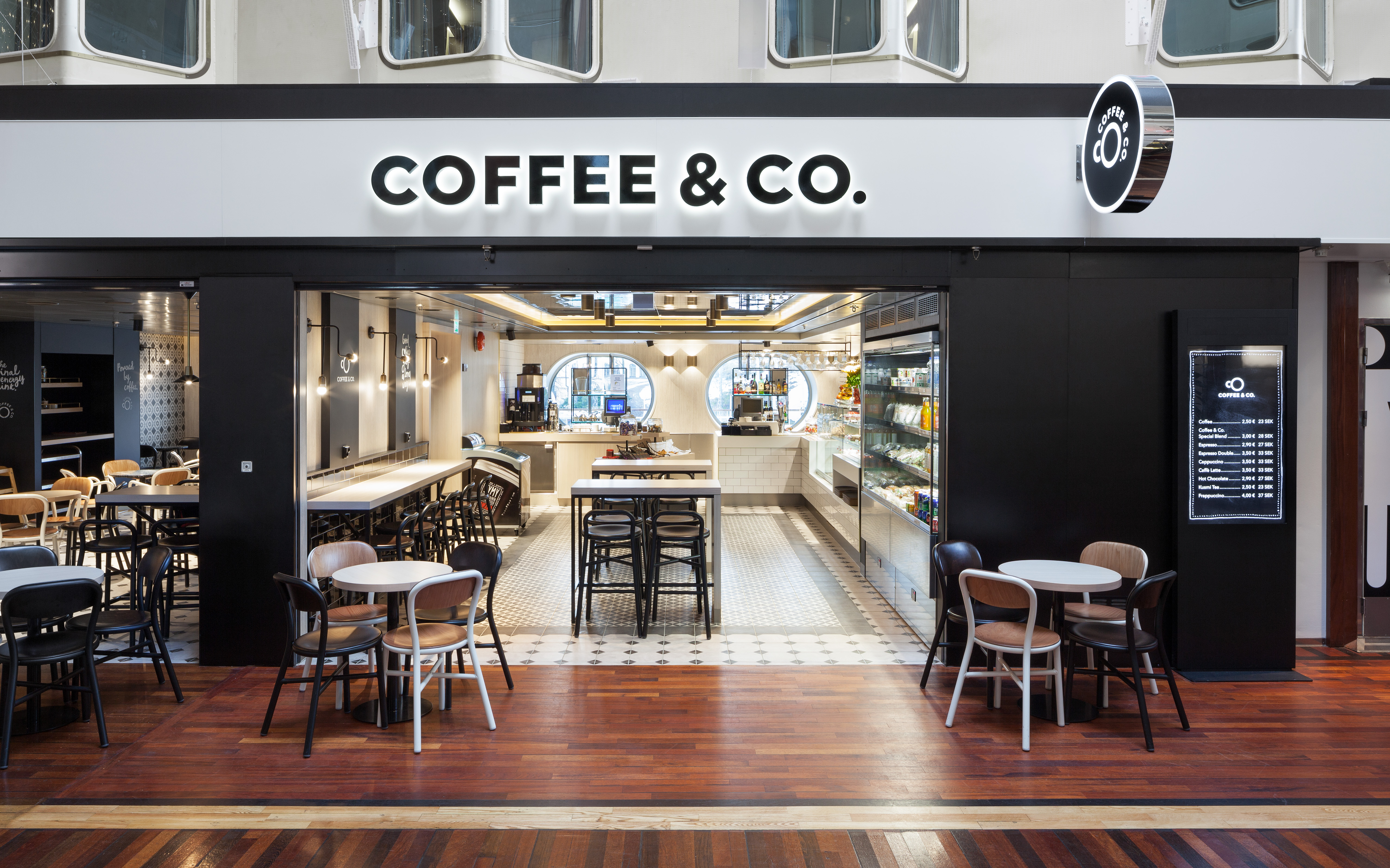
When you see something so simple, you think how have I not seen this before and more importantly, why didn’t I come up with it. Helsinki’s finest Bond have a knack of producing stunningly simple executions that are anything but and with Coffee & Co. they’ve done it again.
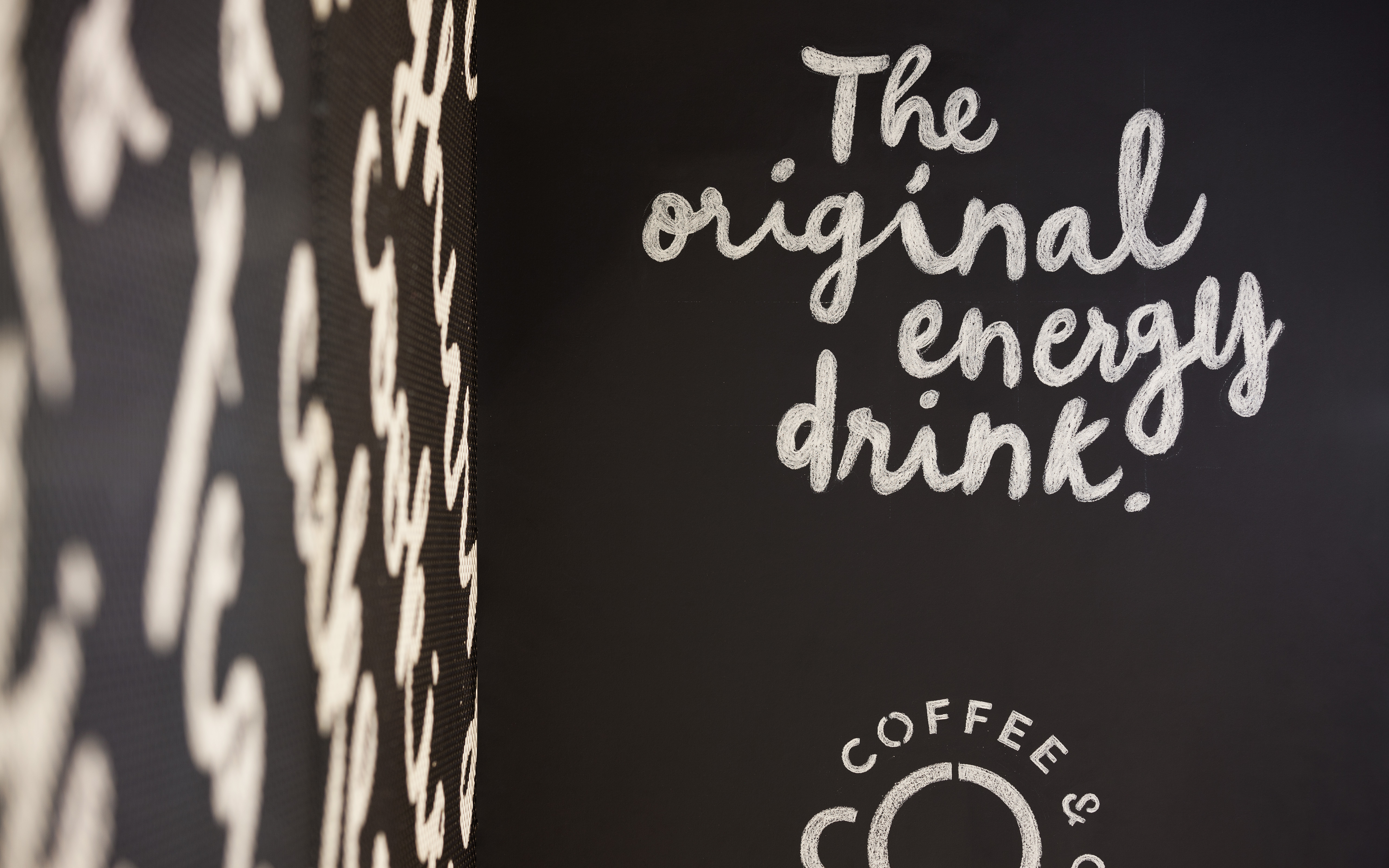
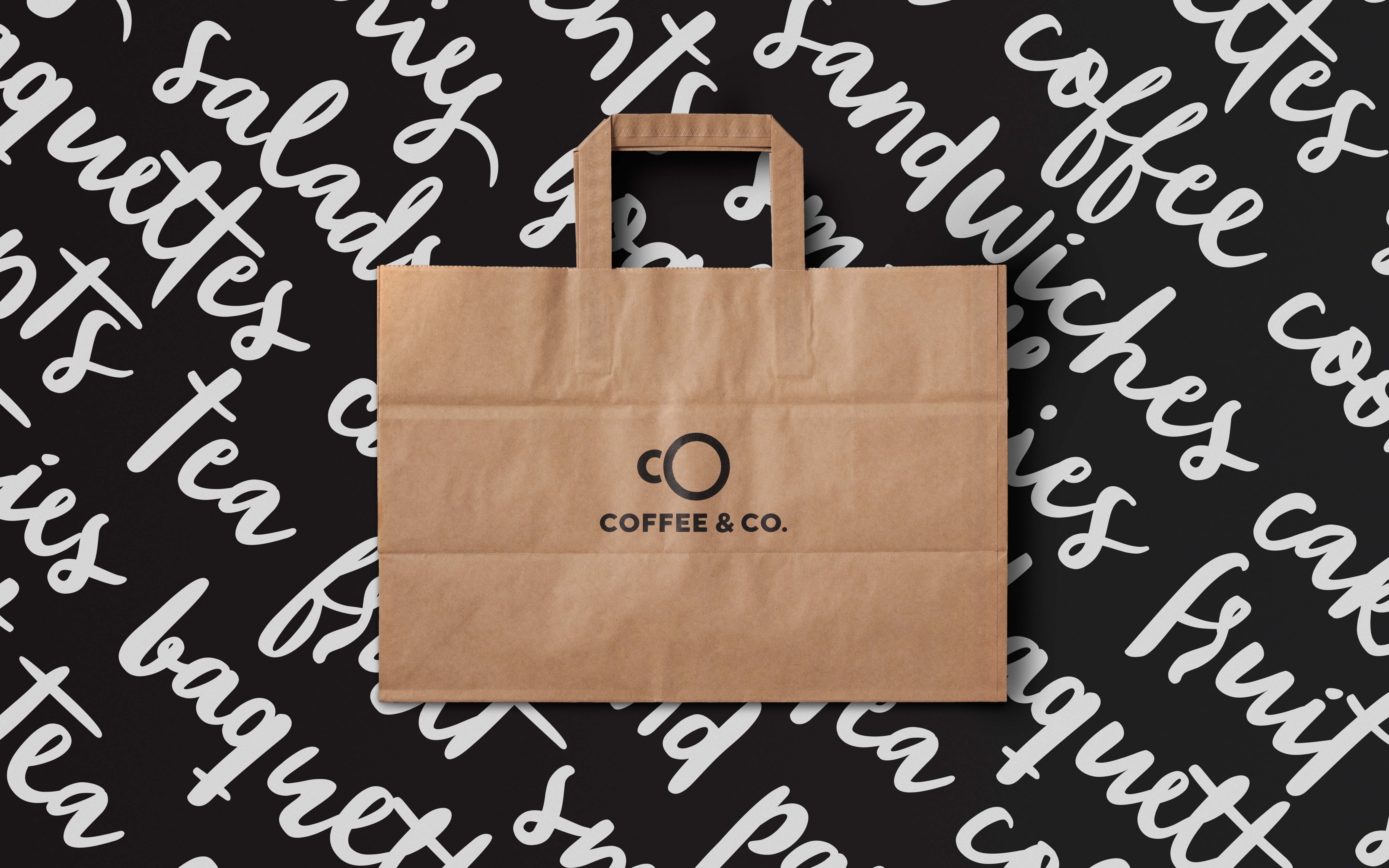
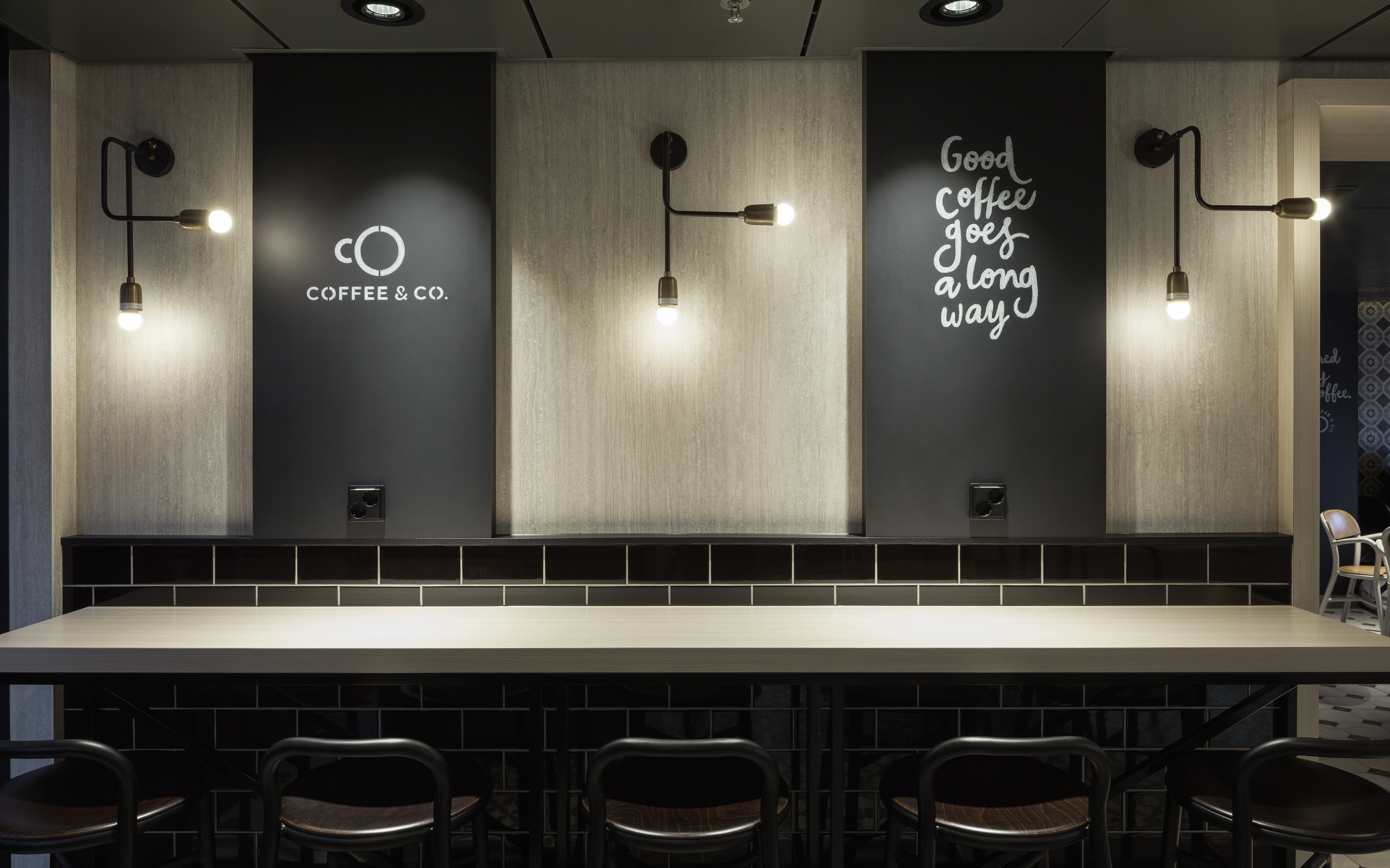
Based around a monochromatic colour palette, the stark contrast between the colours allows the hand writing typography to dance across the page and balance out the carefully crafted mark.
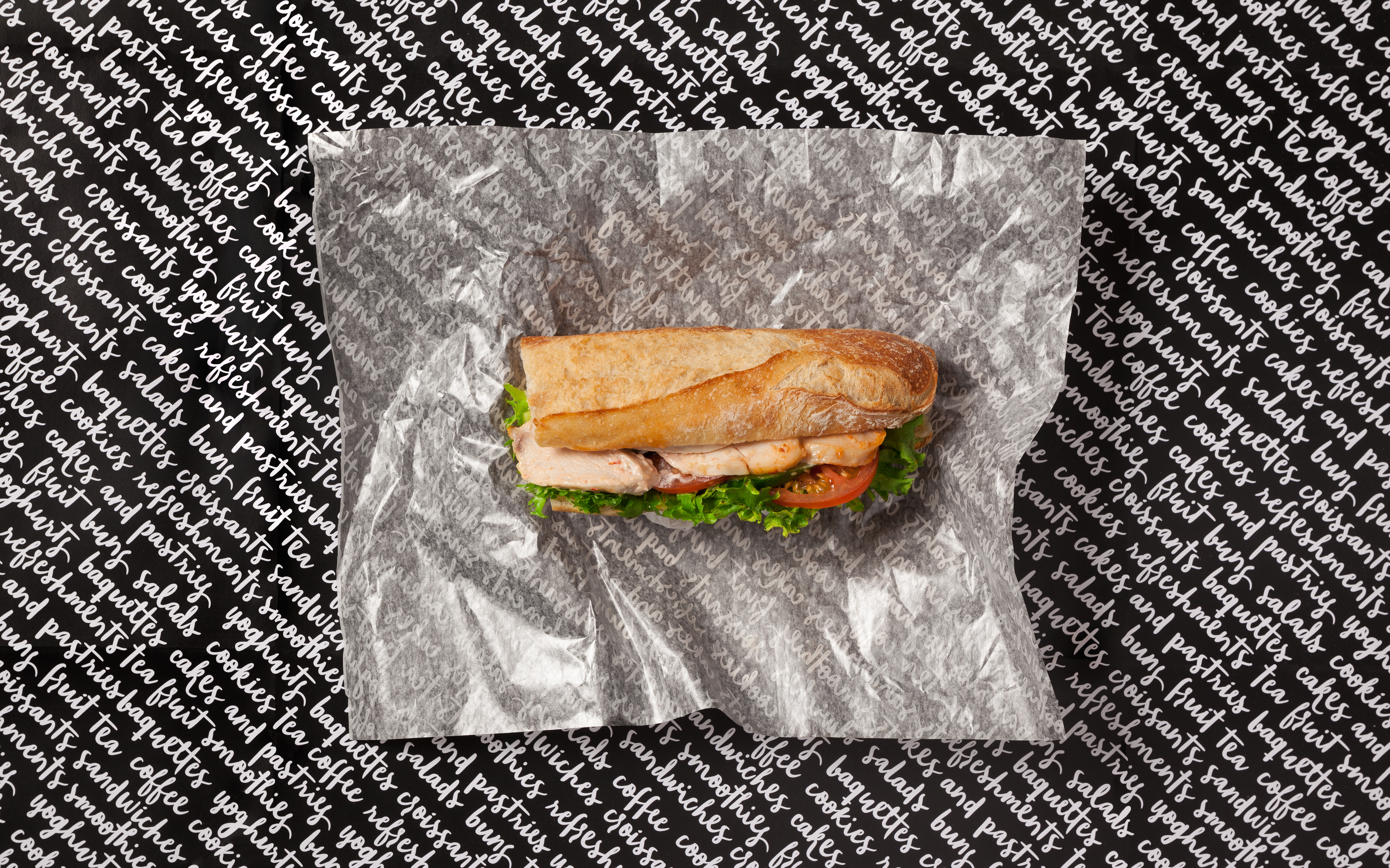
Coffee & Co. is a new cafeteria concept on a Tallink Silja Line cruise ship offering freshly prepared savory and sweet snacks. The aim of the project was to create a friendly and straightforward identity, comfortable for onboard passengers of all ages. The script typography underlines the casual feeling and communicates the selection of offered products.